Welcome. We are formascope. An independent branding agency which creates commercially successful brands.
our latest scope
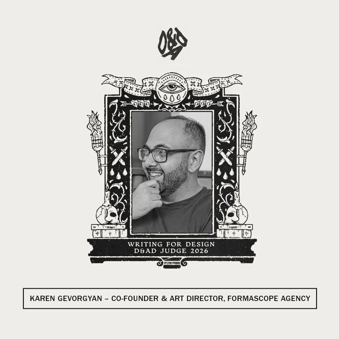
No, our art director is not dead 💀
But he and other jury members will find out whether creativity is - this May in London.
We’re proud to share that our co-founder & art director has been selected as a jury member for the 2026 D&AD Awards. @d_and_ad
Karen is heading to London to join an international panel judging some of the world’s most outstanding creative work.
Being invited to judge at D&AD is not only a personal milestone, but also a meaningful moment for formascope and for the creative industry in our region.
London, see you soon 🇬🇧✏️💛
After last year’s rebranding, our collaboration with Viva, Armenia’s largest telecom operator, continues. We are happy to present Viva’s 20th anniversary film.
What matters has always been around you.
Viva — 20 years around you.
Armenia makes it to the D&AD shortlist — again.
One of the most prestigious creative competitions in the world, D&AD received over 30,000 entries this year. Only 4% made the shortlist. We're proud to say our work is among them.
This recognition is not just about creativity — it’s about strategic thinking, cultural insight, and commercial impact. That’s what D&AD celebrates. And that’s what we bring to every project at Formascope.
We believe world-class design doesn’t need a London or New York zip code. It needs bold ideas, clear purpose, and the courage to stay simple in a world that’s always getting louder.
Inside Skincare Lab wins Dieline Awards! We’re thrilled to share that our packaging design has won the prestigious @thedieline again! And now, our work will be showcased at LUXE PACK New York @luxepack, alongside some of the world’s best packaging. More updates coming soon—stay tuned!
Another addition to our bookshelf!
We’re thrilled to share that our beloved project, Ootelie Artisan Bakery, has been featured in SendPoints’ latest book, The Color Trio: Play with Red, Yellow, and Blue! This vibrant collection celebrates creative use of colors, and Ootelie stands out by embracing the unconventional choice of blue in its brand identity.
We’ve done it again!
For the second year in a row, formascope has been recognized at the Art Directors Club of Europe, this time for Inside Skincare Lab! Out of all the submissions from across Europe, only 7 packaging designs were awarded, and we’re incredibly proud to see our work among them. Here’s to more milestones and pushing boundaries in design!
2024 marked a significant period of change for Viva, a leading Armenian telecommunications operator founded in 2005. The announcement of Viva’s separation from the MTS Group earlier this year called for an exciting rebranding project to align with the direction in which the company is continuously moving. Joining forces with the formascope agency, the two embarked on a journey to create a refreshed visual identity and language for Viva.
Independent branding agency, Formascope, recently completed a packaging redesign for Tanbing, a coffee product by Nongfu Spring, China’s largest bottled water company.
The packaging design centers on the concept of a complete coffee experience, with each element enhancing the consumer’s interaction with the product.
It emphasizes visual elements like colors and shapes that evoke and resonate with coffee culture, blending tradition with modern aesthetics and with a creative use of typography.
INSIDE SKINCARE LAB’s packaging design, created by formascope.agency offers a peek into the brand’s scientific process, with perforated elements that reveal handwritten notes from chemists scanned directly from lab experiments.
The intricate details and intentionally concealed trade secrets on the inner packaging not only add an air of mystery but also emphasize the brand’s commitment to transparency and scientific backing.
AdBlackSea is over, but our emotions are still high. For the second year in a row, we won gold, this time for Inside Skincare Lab. Devotion to creativity and to the work you love always pays off.
Thanks, AdBlackSea, for an amazing event!
"Formascope’s Tanbing design looks to China’s growing coffee culture and delivers a sleek, premium look that resonates with modern coffee drinkers."
"Exploring Inside Skincare Lab’s Unique Packaging Displaying the Chemist’s Notes"
We had an incredible time at the Food and Beverage Innovation Forum (FBIF) in Shanghai! It was an honor to present three of our works at one of the most influential food-industry events in the Asia-Pacific region. FBIF is all about sharing global success stories, cutting-edge concepts, and innovative technologies that shape the future of the food and beverage industry.
We were also thrilled to be invited to give a talk on “The Power of Simplicity in Brand Design: Translating Product Function into Market Success.” It was an amazing opportunity to share our insights on how simple, effective design can drive market success.
Thank you, FBIF, for this fantastic experience!
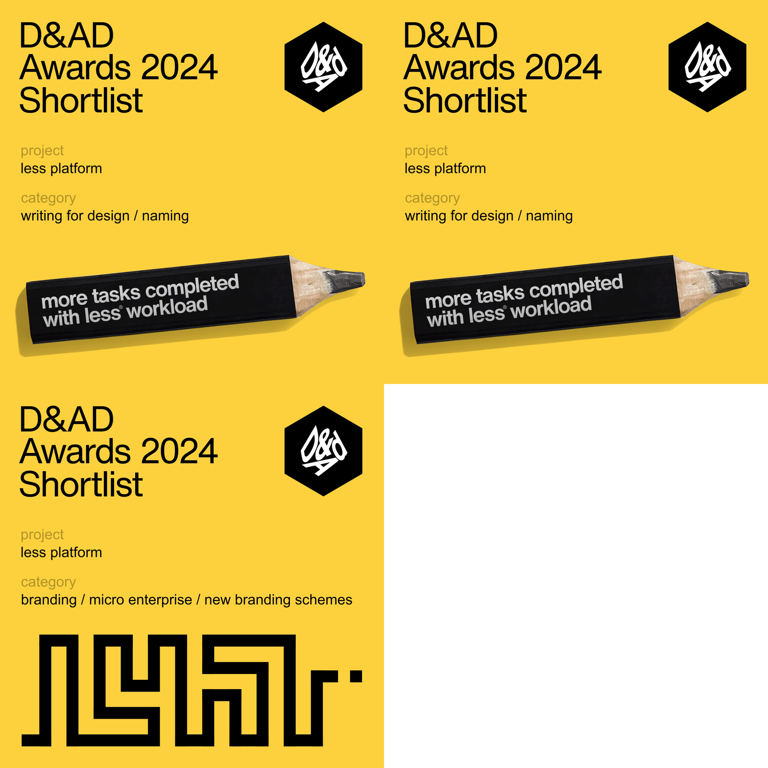
Our work for ‘less platform’ got shortlisted in two categories in D&AD Awards, in one of the world’s toughest creative competitions.
Proud to see Armenia on the list for the first time!
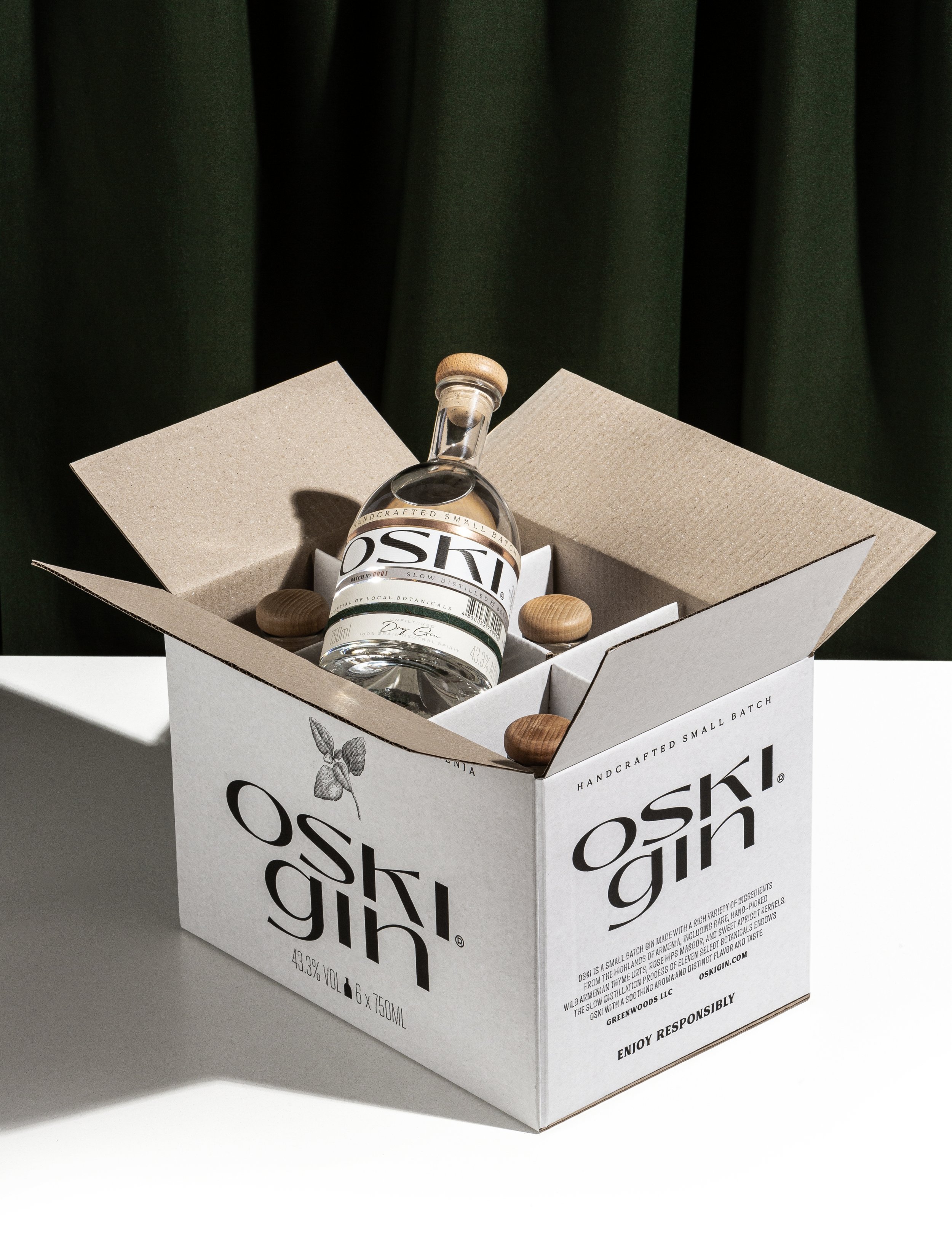
The best thing about gin is its focus on smooth herbal notes, mainly juniper, and it makes a good sip feel like a refreshing breath of winter air. The great-looking Oski Gin puts the spotlight on herbs from Armenia, and it’s apparently the first to make use of the country’s prized mountain thyme.
The small-batch brand takes its name from the Armenian word for “gold,” so the design deserved a special, sophisticated touch. formascope agency nailed the brief with a low-key yet highbrow aesthetic, accenting simple black text on white paper with bands of coppery metal and grassy green sustainable paper. We’re especially into the funky wordmark, a blend of upper and lowercase san serif text elegant enough to look seamless.
In August 2023, a team, including Lars Harmsen, Markus Lange, and Rene Wawrzkiewicz, embarked on a journey from Tbilisi, Georgia, to Yerevan, Armenia. Along the way, they delved into the studios of numerous designers and artists, and our studio was not an exception. We extend our sincere gratitude for their tremendous efforts and dedication.
As the year draws to a close, we’re excited to share that we’ve secured the #6 spot among independent agencies in ADCE’s Creative Rankings, highlighting the best European countries, agencies and studios of the year.
Notably, beginning this year, ADCE has merged with The One Club for Creativity. Points earned in the ADCE European Rankings will contribute to The One Club’s Global Creative Rankings, making it industry’s foremost global ranking for countries, agencies, brands, work, and creative professionals.
We have been shortlisted for the 2023 Epica Awards with the brand identity created for a Canadian company.
Founded in 1987, the Epica Awards jury has been exclusively composed of editors and senior reporters from the world’s leading titles covering creativity and communications.
From day one, our studio has been dedicated to crafting commercially successful projects for our clients. It's rewarding that our work is not only appreciated by clients and consumers but also recognized within the professional community. We take pride in our small yet exceptional team.
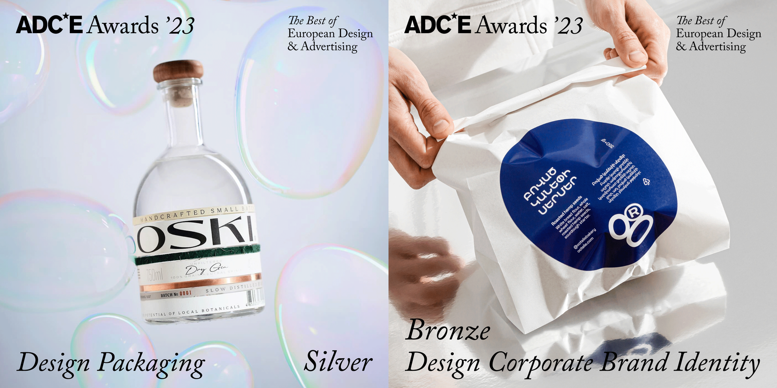
We achieved a significant milestone by winning the first Art Directors Club of Europe for Armenia, securing both Silver and Bronze awards.
That’s it! The Ad Black Sea 2023 is over, but the emotions it stirred are still very much alive. Now it's time to evaluate the results:
Gold - oski gin - Visual Craft / Art Direction
Silver - ootelie artisan sourdough bakery - Design & Branding / Corporate & Brand Identity
Bronze - prawtein raw pet food - Design & Branding / Packaging
Bronze - less platform - Design & Branding / Corporate & Brand Identity
We are thrilled to announce that our agency has emerged victorious at the prestigious Dieline Awards! It's a tremendous honor to be recognized among the industry's best and brightest. Our team's dedication and creativity have paid off, and we couldn't be prouder!
Logos. Why do some of them stick and others don't? Also, how do you go about them knowing they can make or break a brand's image? And most importantly, how do you make your brand's face both modern yet timeless? These are the questions that every graphic designer thinks of at some point in their creative endeavors.
Made with multiple materials and printing processes, labels play a crucial role in the spirits sector and rely heavily on design. They can also be a potent vector for technology. First published in the spring 2023 issue of Formes de Luxe, they round up the latest trends in the sector of spirits labels.
FAB News is a part of adFAB Media Group, which also run The FAB Awards. Food & Beverage News is an editorially led publication that covers all stories and topics pertaining to the food and beverage industry.
We’re proud to say that we’ve won awards for all four projects we entered! 1 x gold, 2 x silver, 1 x bronze
According to Global agency ranking by World Brand Design Society which represents the most awarded and leading agencies in the field of consumer and corporate brand design in the world we are #16 this year!!!
gráffica.info is a medium dedicated exclusively to the world of design, and especially to the field of graphic design, creativity and visual culture.
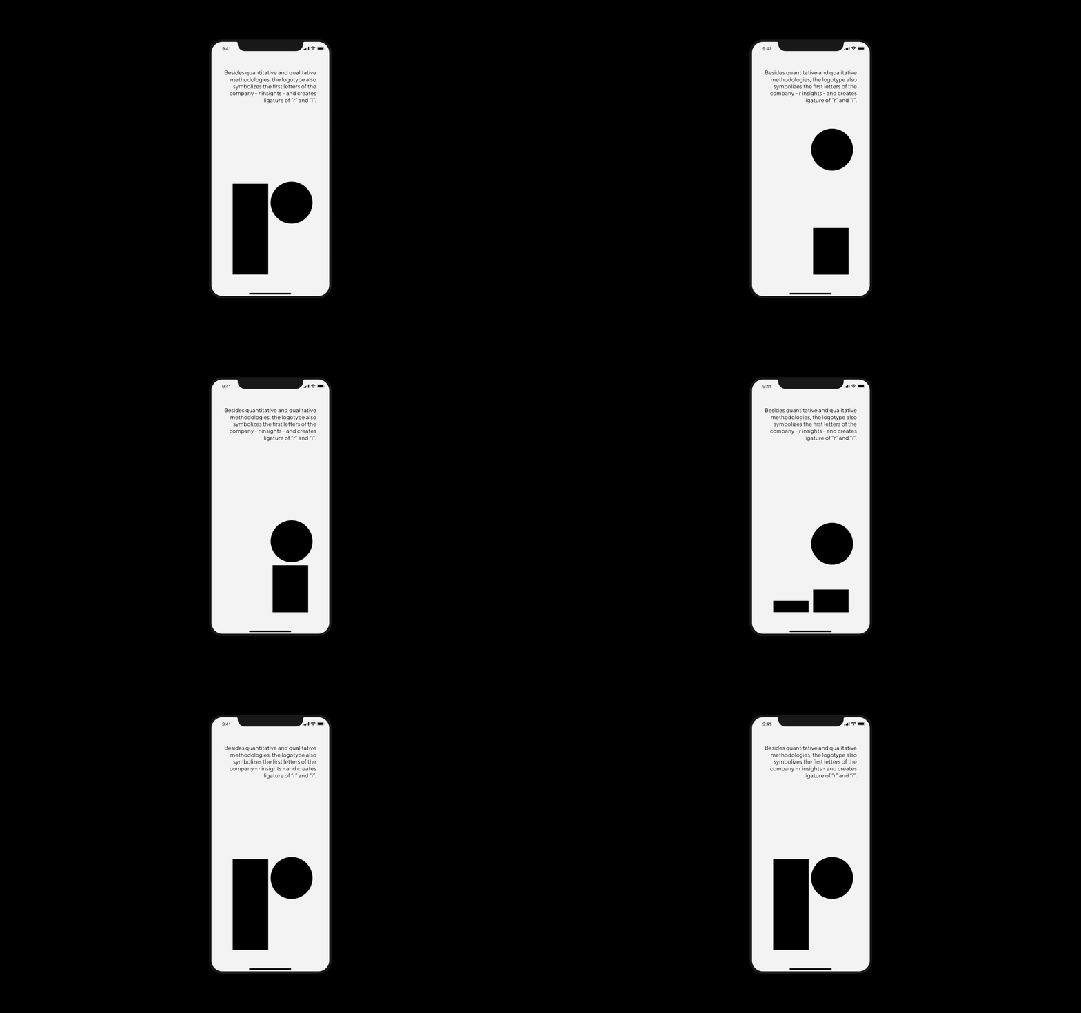
“Did you unravel the mystery of the logo? Let us give you a hint: Quantitative and qualitative methodologies. The quantitative one represents a data collection method that gathers and analyzes information from a large number of respondents. On the other hand, the qualitative method seeks to convey people’s thoughts and feelings that might influence their behavior.”
‘‘The Yerevan-based brand agency created a label design of 7 layers to deliver the depth and value of OSKI, which translates to ‘gold’ representing purity’’
We have been shortlisted for the 2022 Epica Awards with our packaging for Prawtein in Packaging Design category!
Founded in 1987, the Epica Awards jury has been exclusively composed of editors and senior reporters from the world’s leading titles covering creativity and communications.

