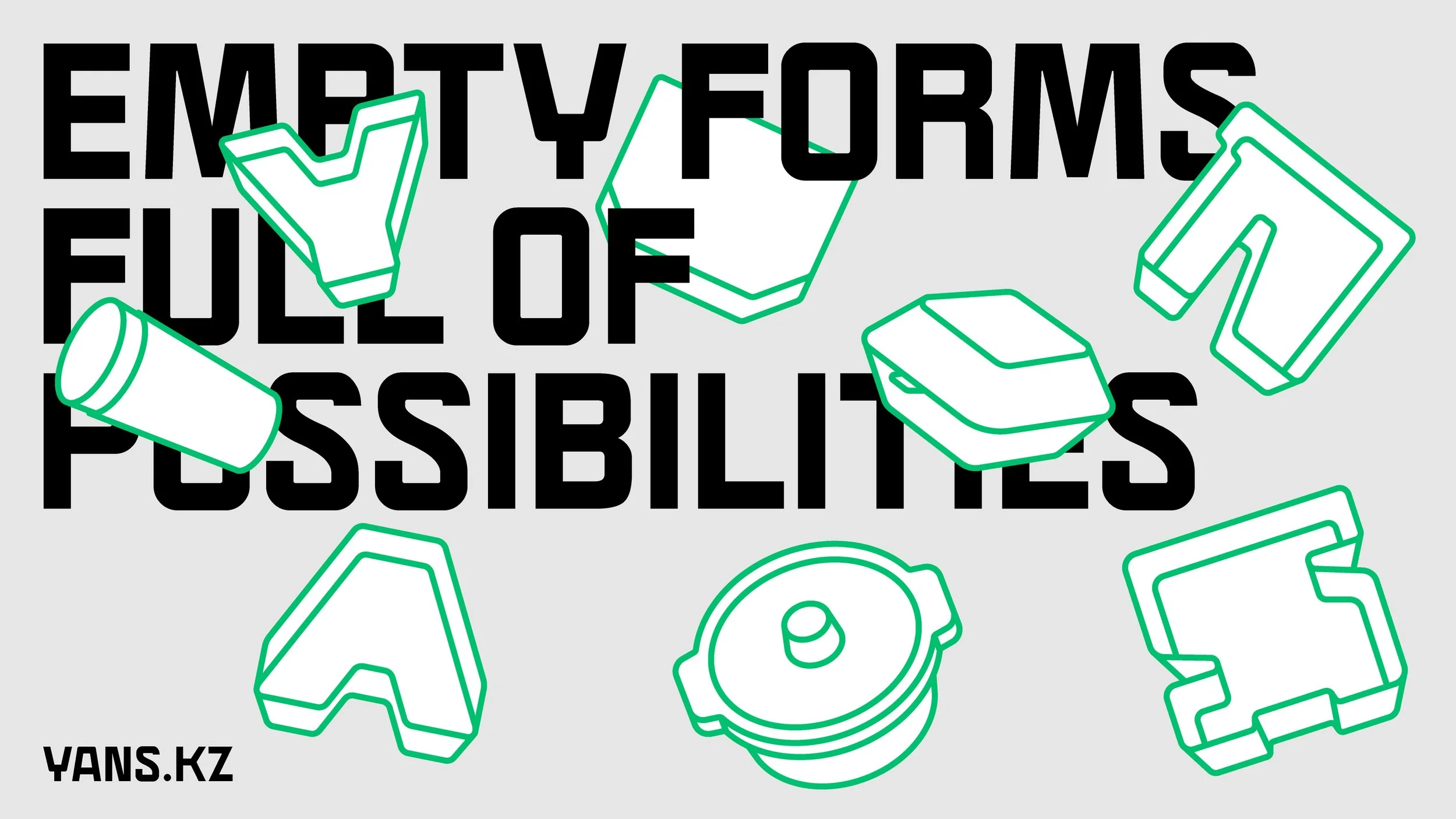
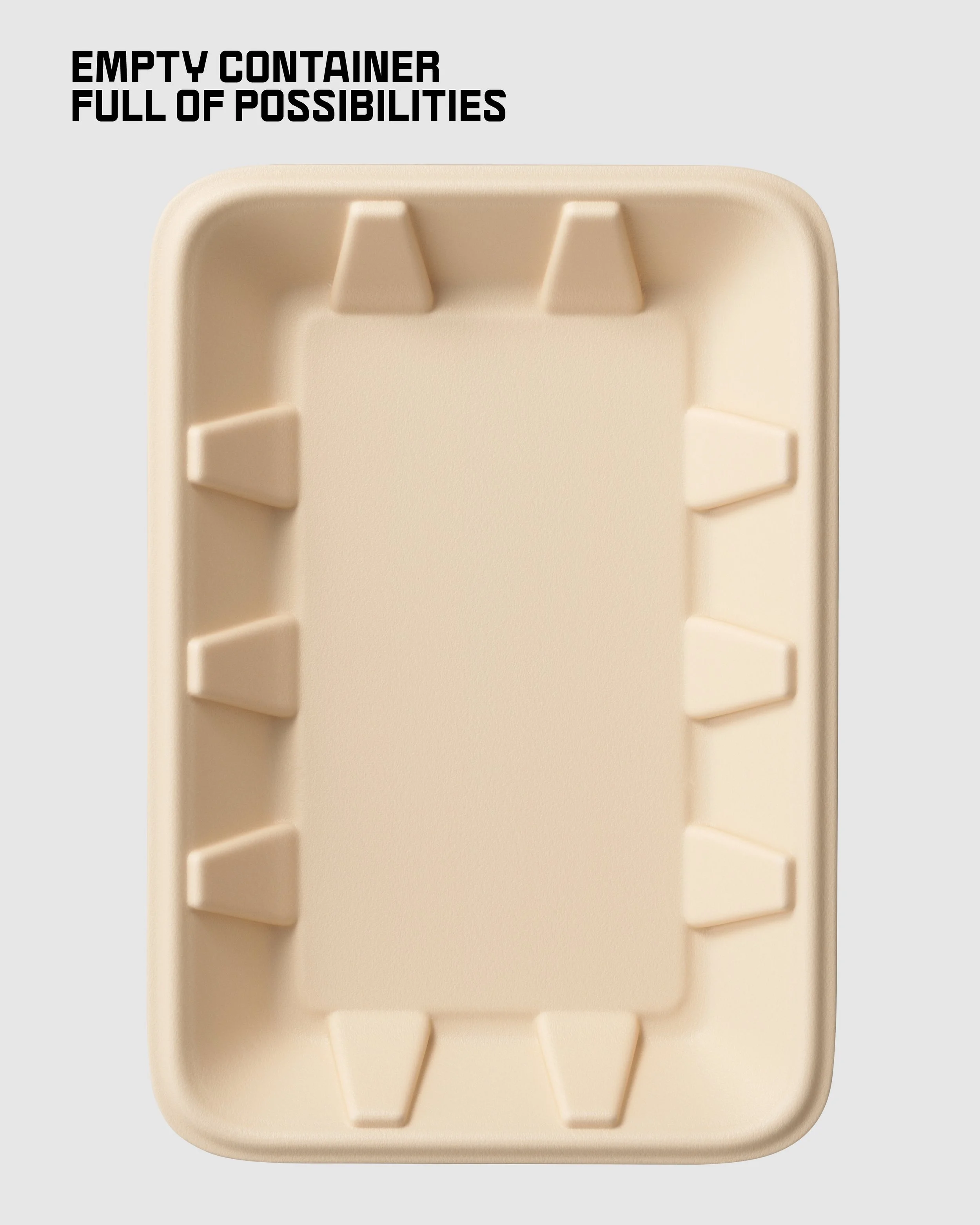
empty forms full of possibilities
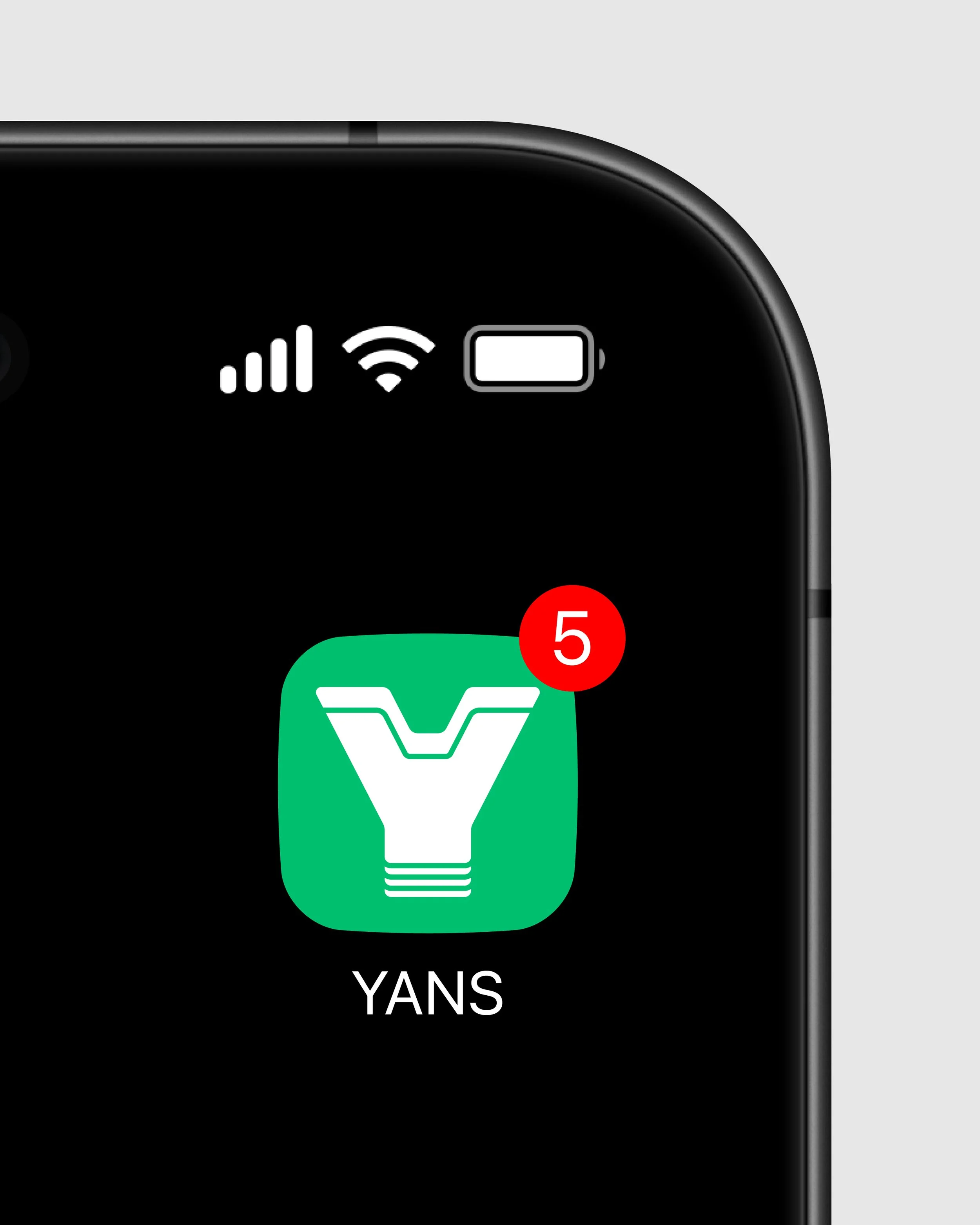
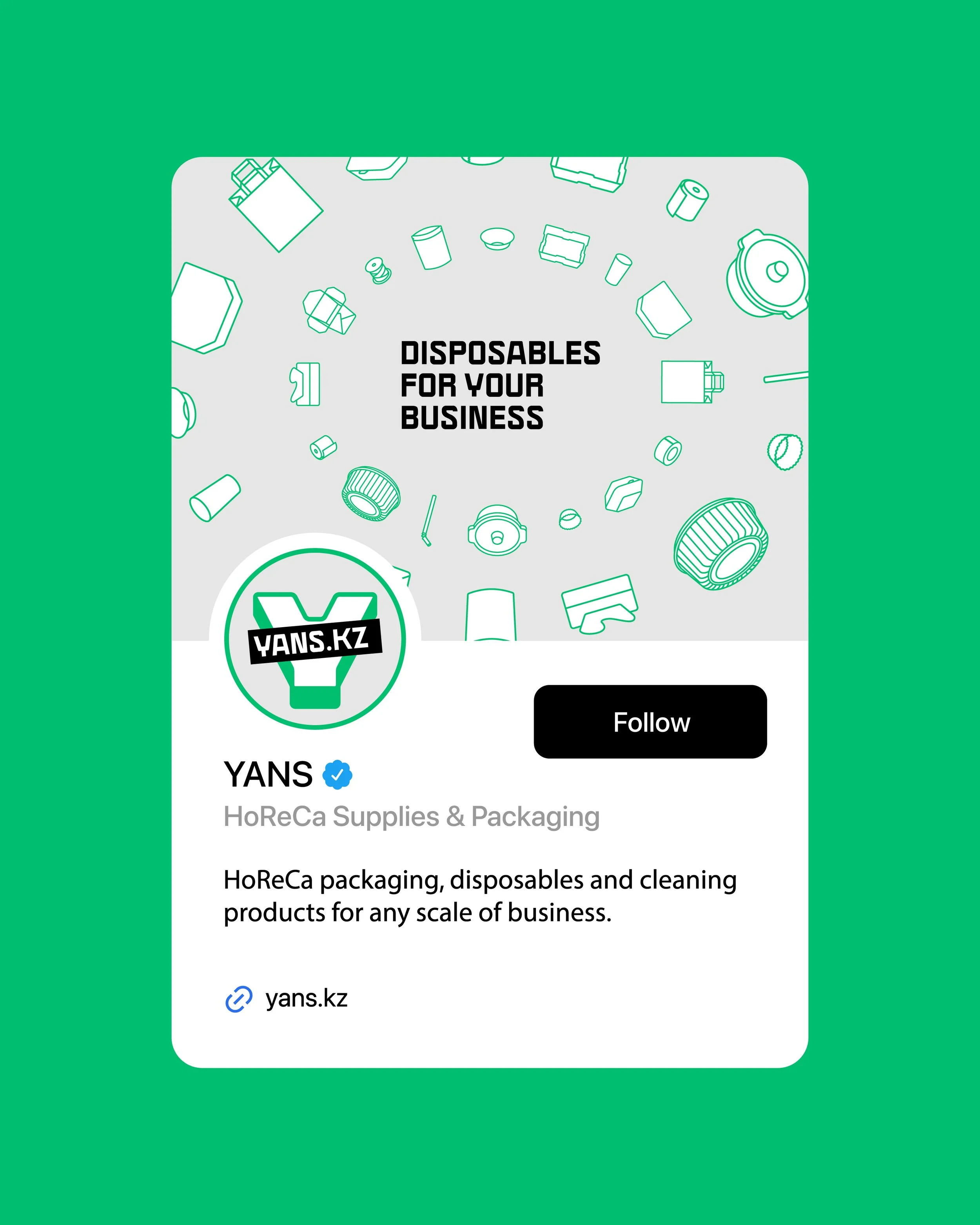
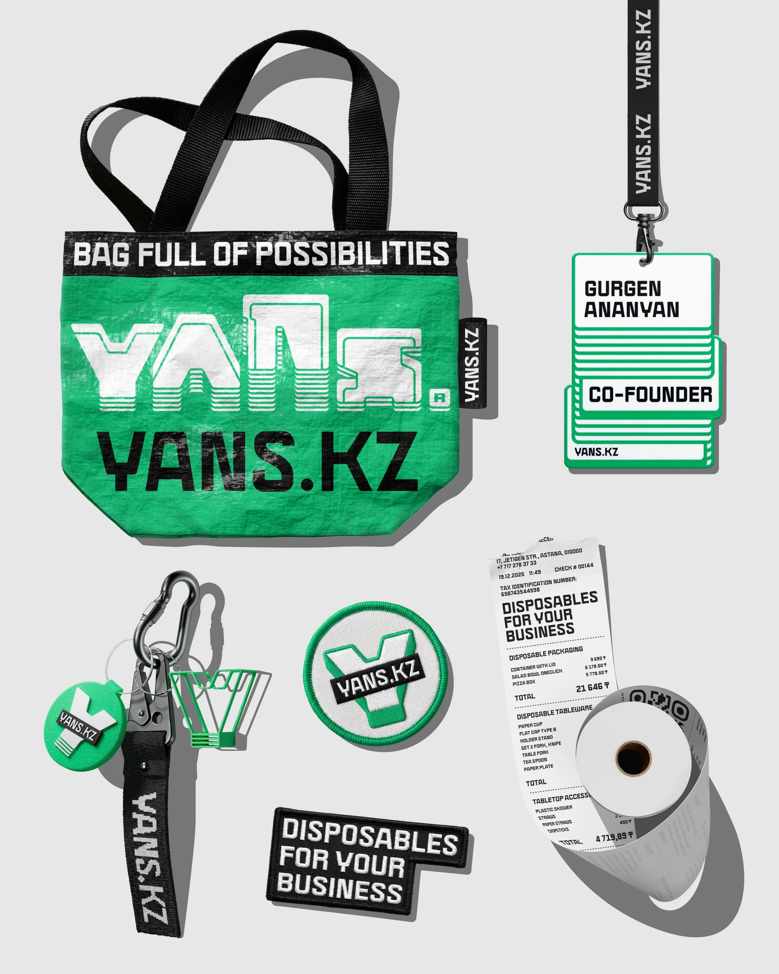
yans ® supplies and disposables
client: yans llccategory: supplies and disposable itemscountry: kazakhstanservice: brand concept development, brand slogan, brand identity design, ui/ux design, mobile app design, communication materials, communication strategy, brand guidelines, merch design, 2D/3D motion designSometimes, the smallest and most invisible things make the biggest impact. YANS is a B2B company that specializes in supplies and disposable items for HoReCa, hospitals, and a wide range of professional industries. As the company expanded into new cities and countries, it approached us to rethink the brand and develop a clear, future-ready strategy.
The Challenge
How do you transform a brand built on objects that are simple, everyday, and often overlooked? How do you express value when your product is something that’s meant to be used once and thrown away?
The Idea: Emptiness as Potential
We found the answer in a single, powerful idea: Emptiness. The concept of Emptiness revolves around simplicity, flexibility, and personal choice. Every container begins as a “blank slate” - an empty form full of potential. This emptiness is not a limitation, but a space that adapts seamlessly to any business, product, or scenario.
The new visual system embraces a clean, minimalistic aesthetic inspired by the pure geometry of containers. At its core lies the idea of emptiness as potential. Empty containers become a powerful metaphor for possibility.
Visually, the brand operates in two states:
Empty — highlighting openness, simplicity, and untapped potential.
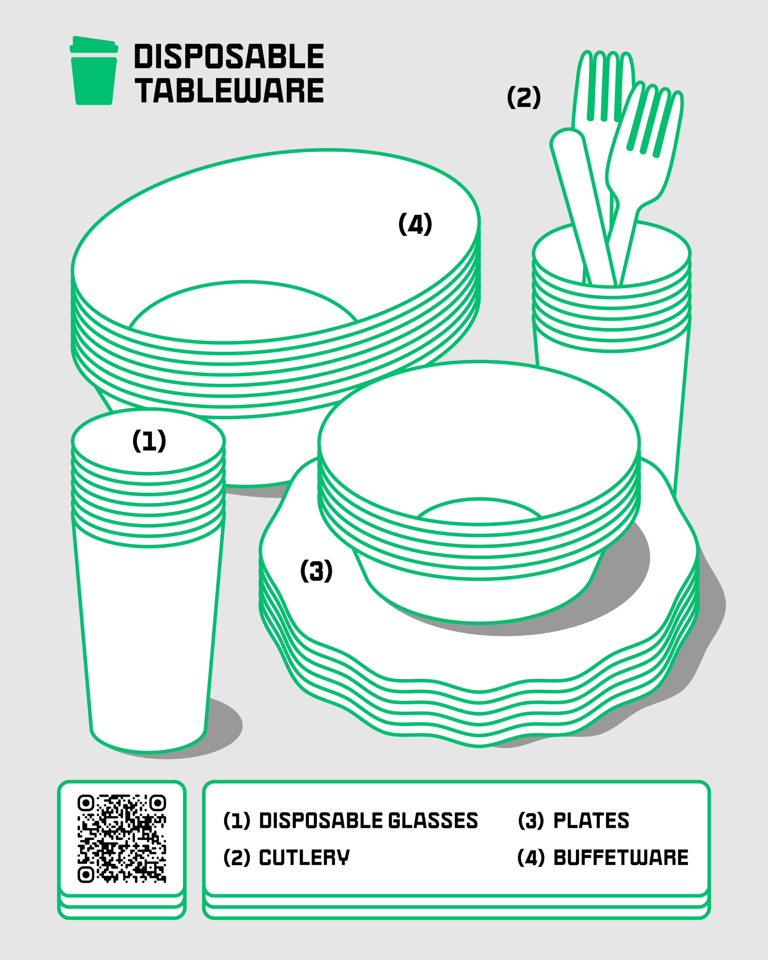
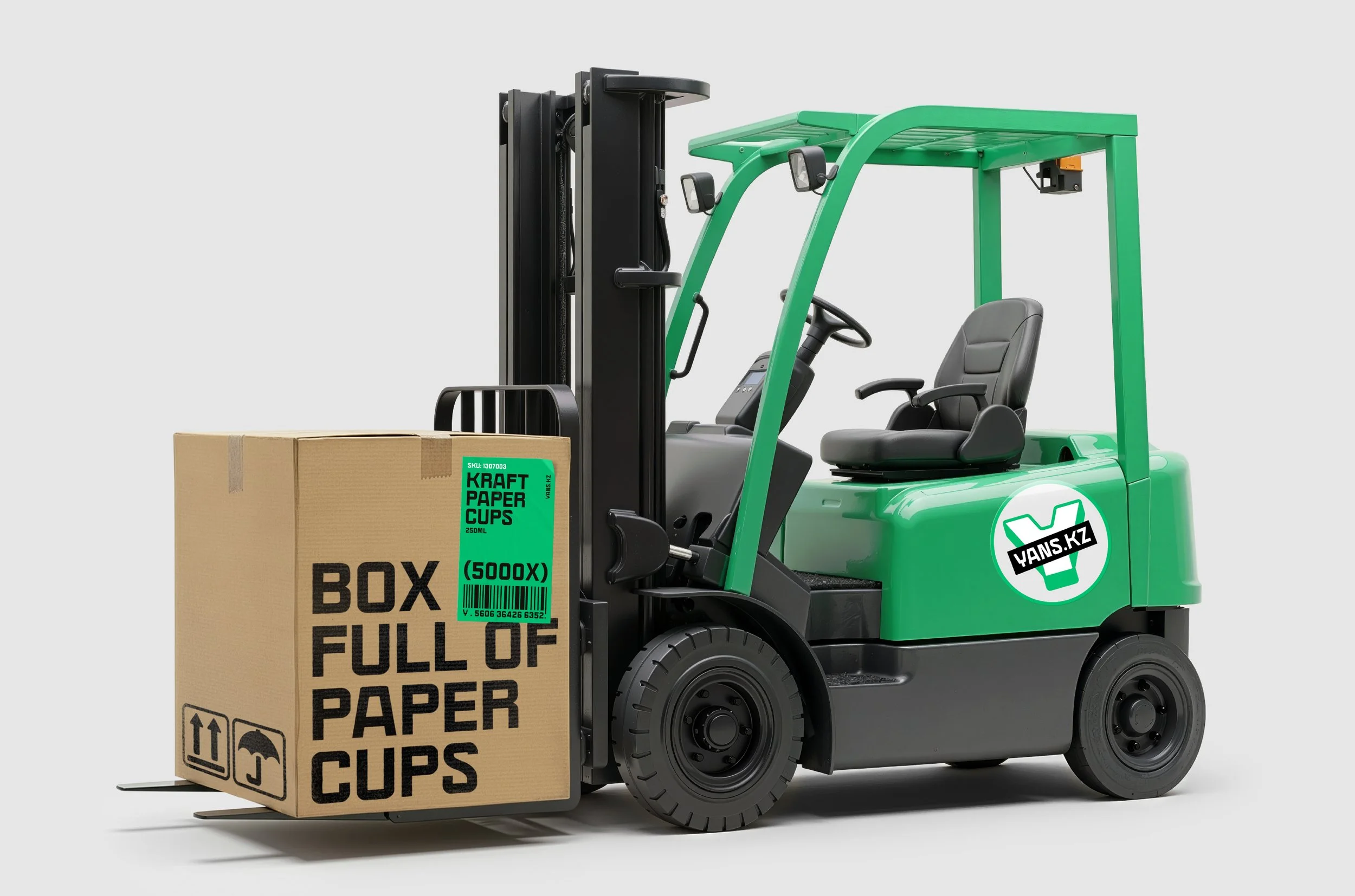
Full — showing endless real-world uses, from fruits and salads to burgers, coffee, and everyday meals.
This duality captures the essence of YANS: they provide the empty form, and businesses fill it with purpose. At the heart of the brand sits a dynamic slogan, designed to shift depending on context.
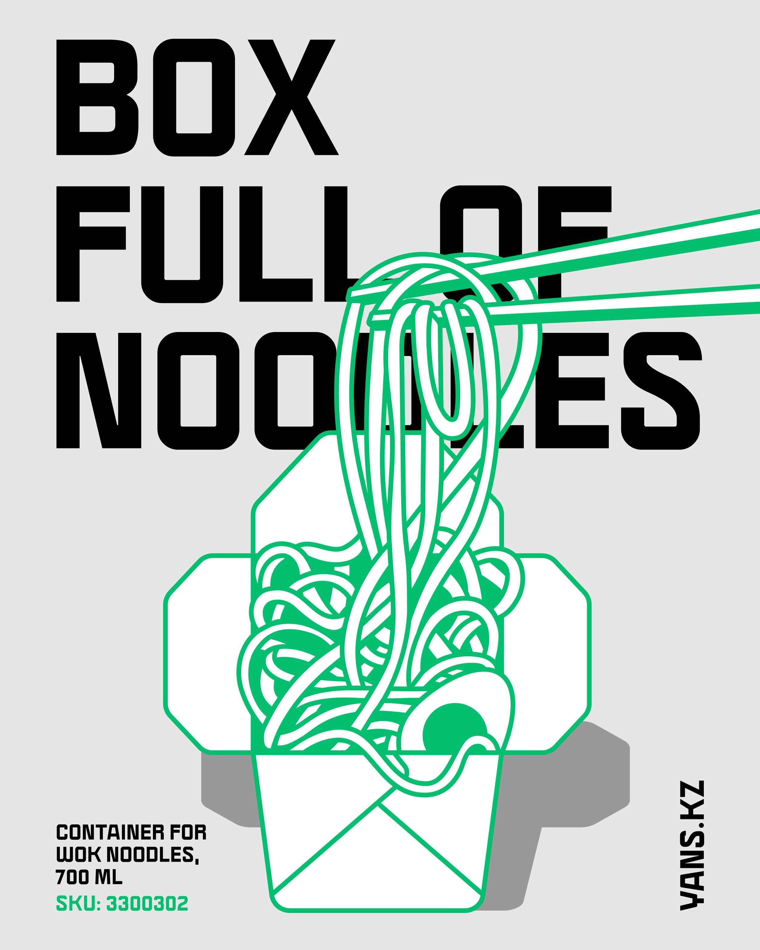
The core line is: “Empty forms, full of possibilities.” But the system is intentionally flexible — transforming just like the containers themselves:
Container, full of strawberries
Box, full of ideas
The slogan becomes a living language that adapts to content, product categories, and storytelling moments, reinforcing the brand’s promise across every touchpoint.
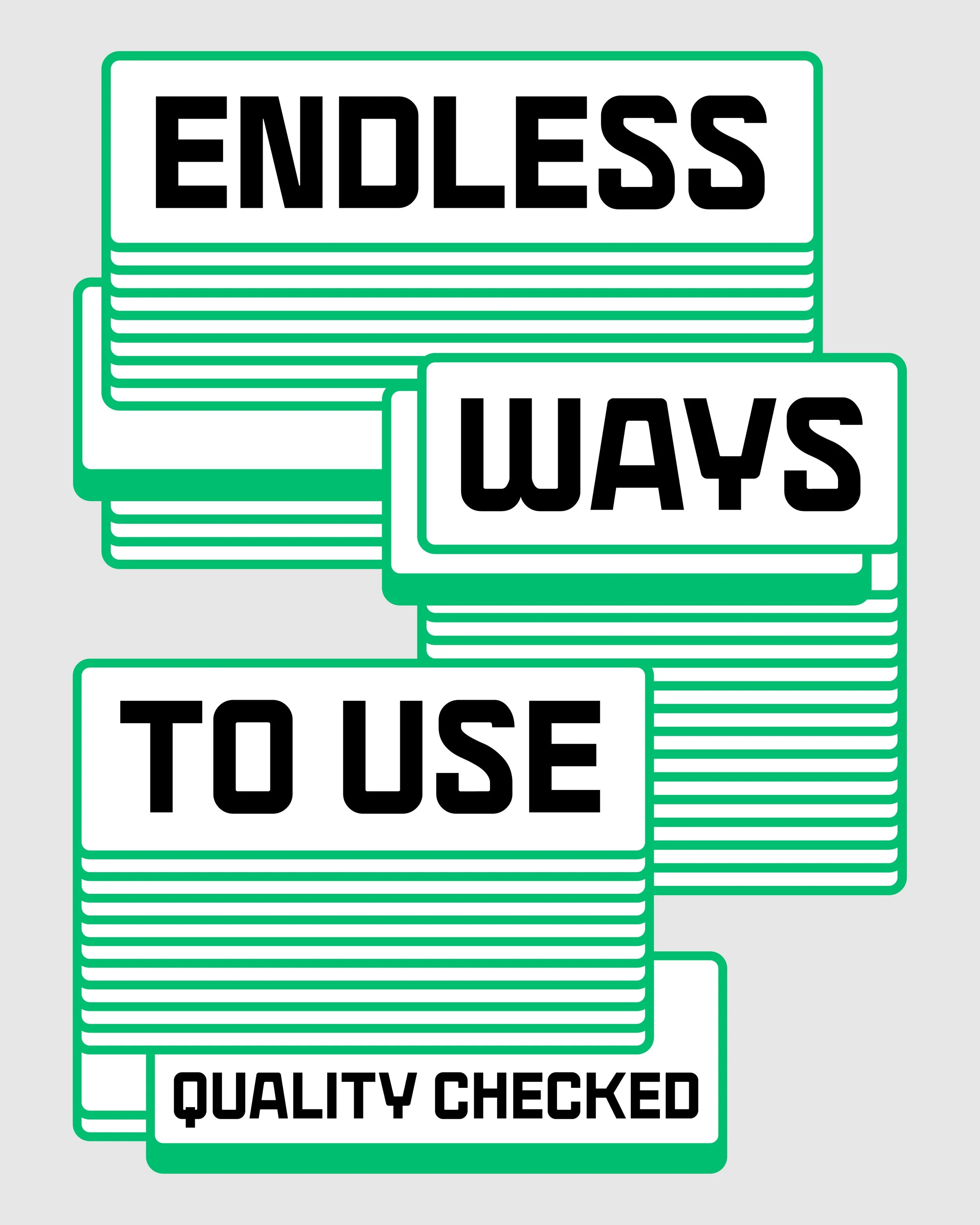
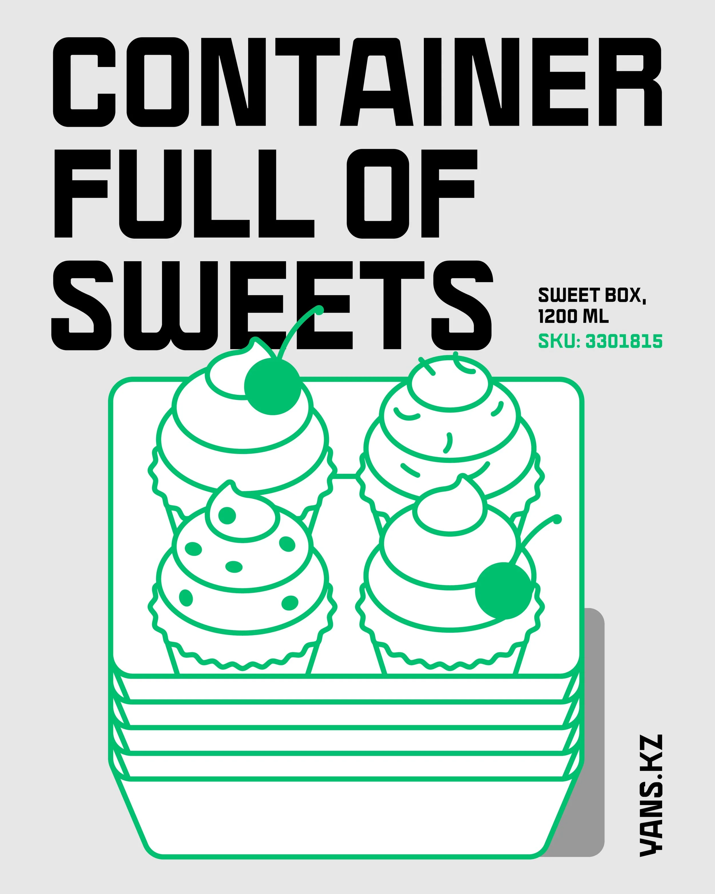
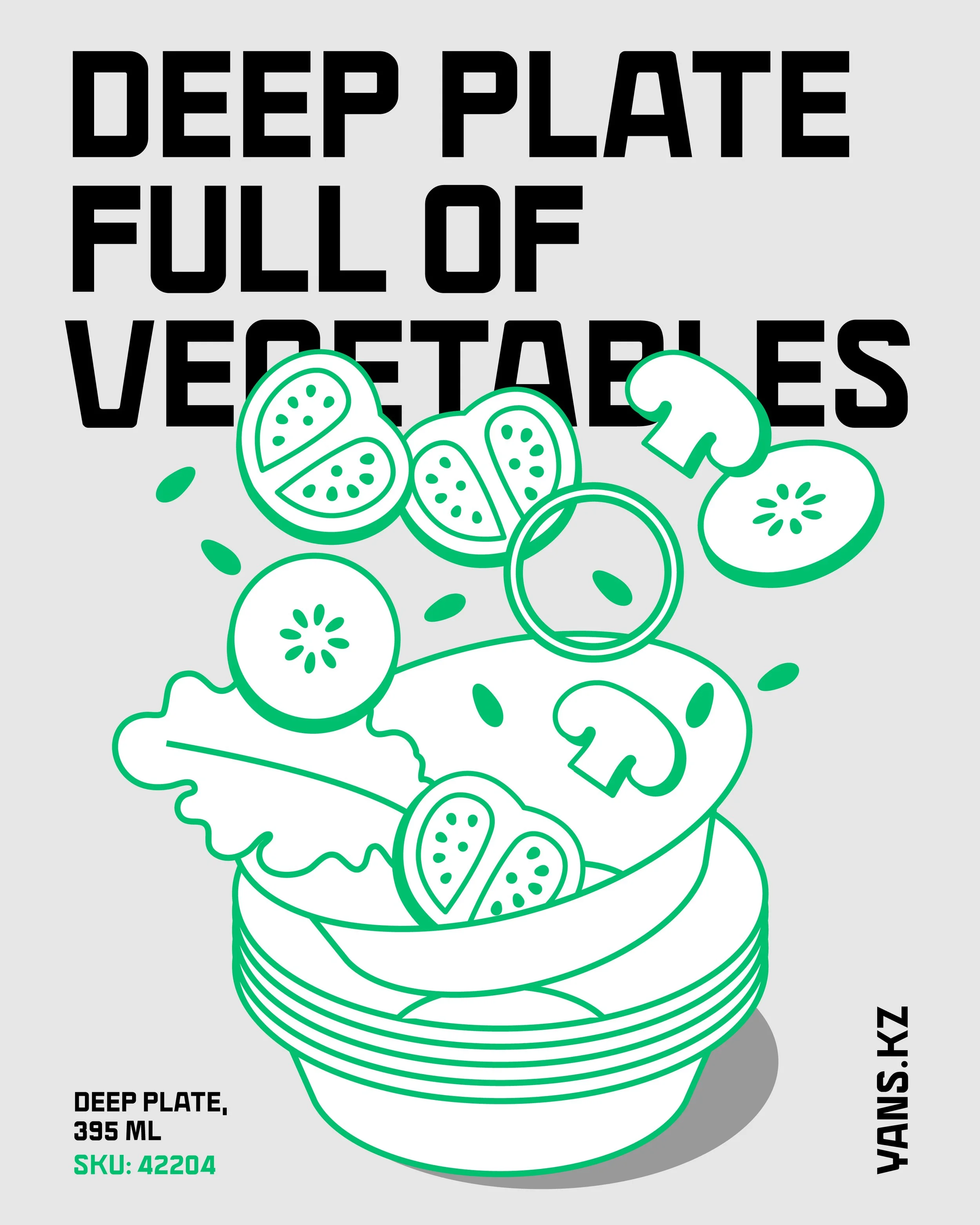

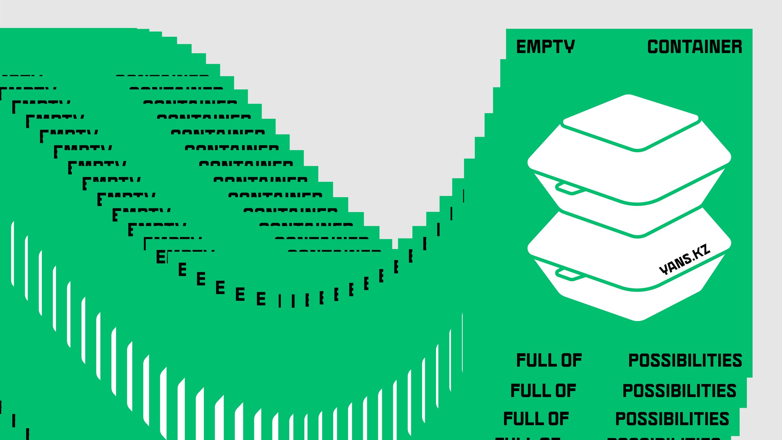
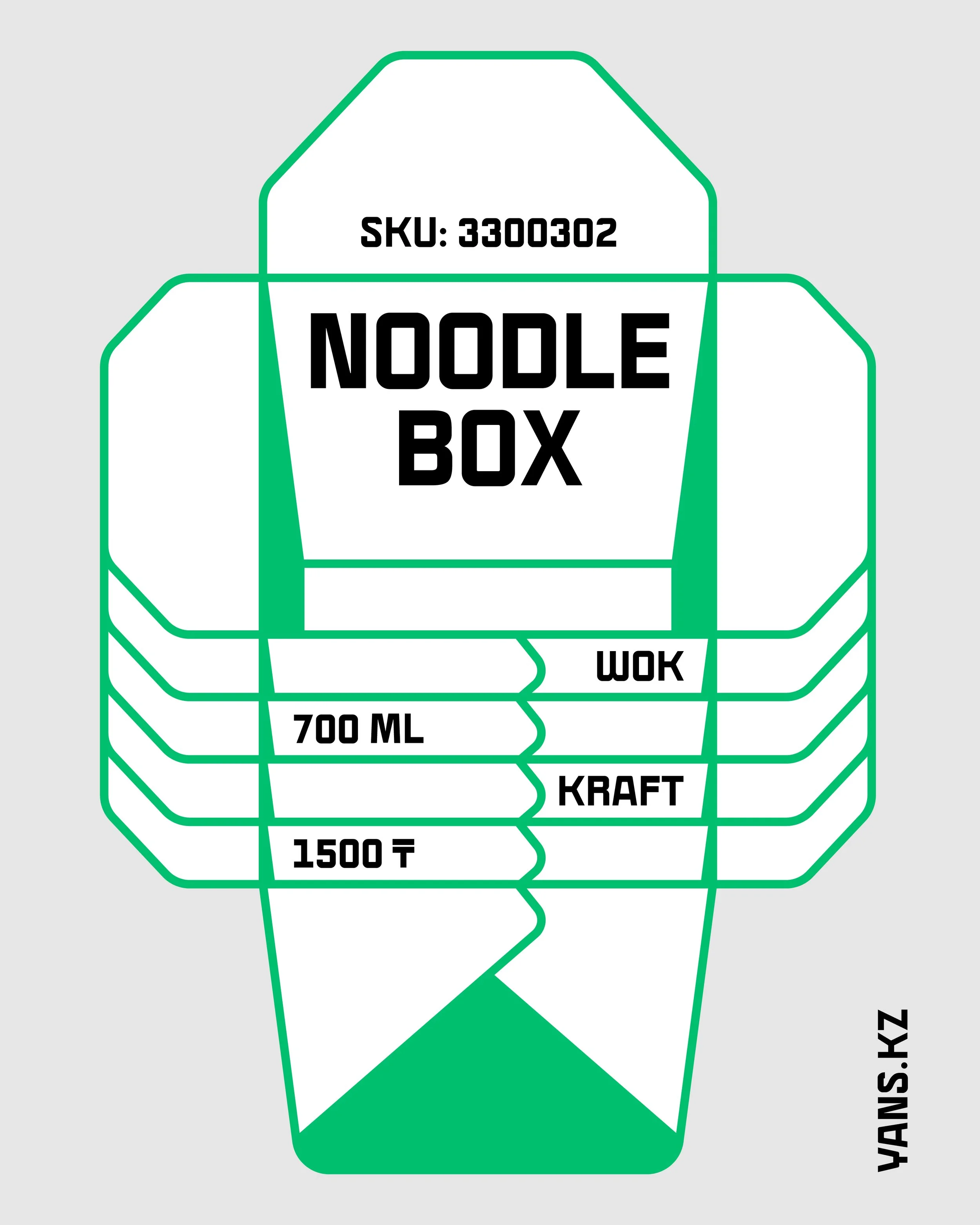
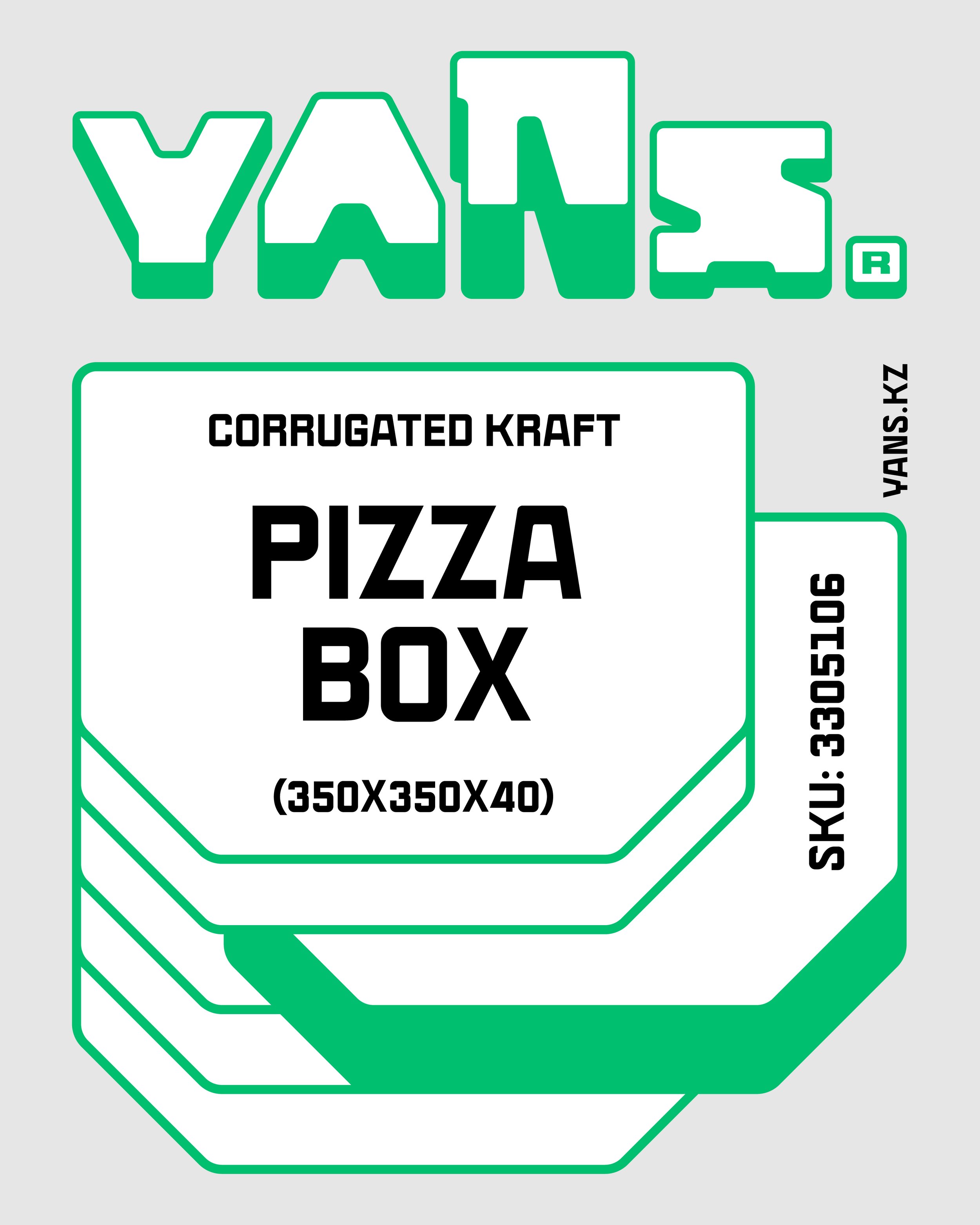
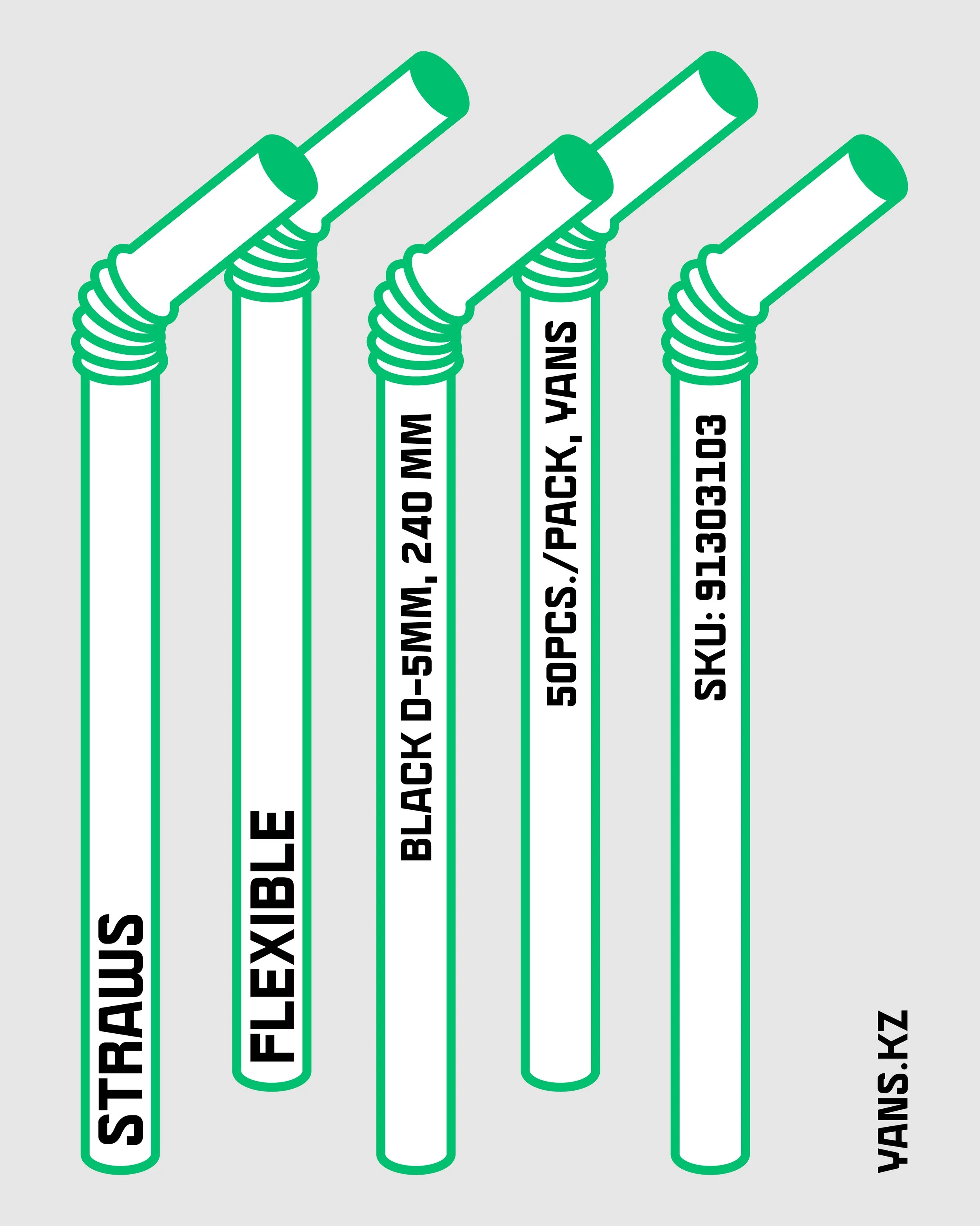
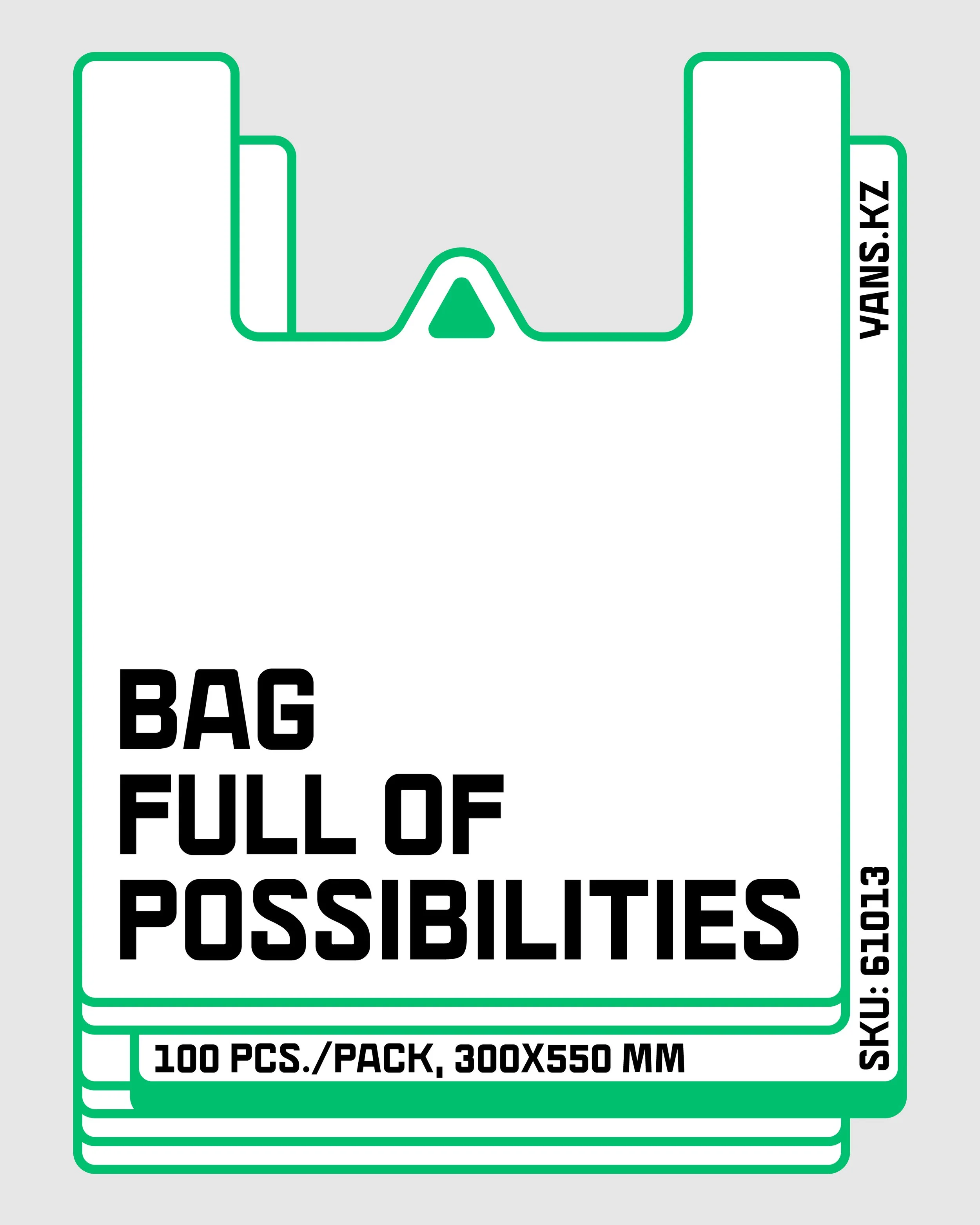
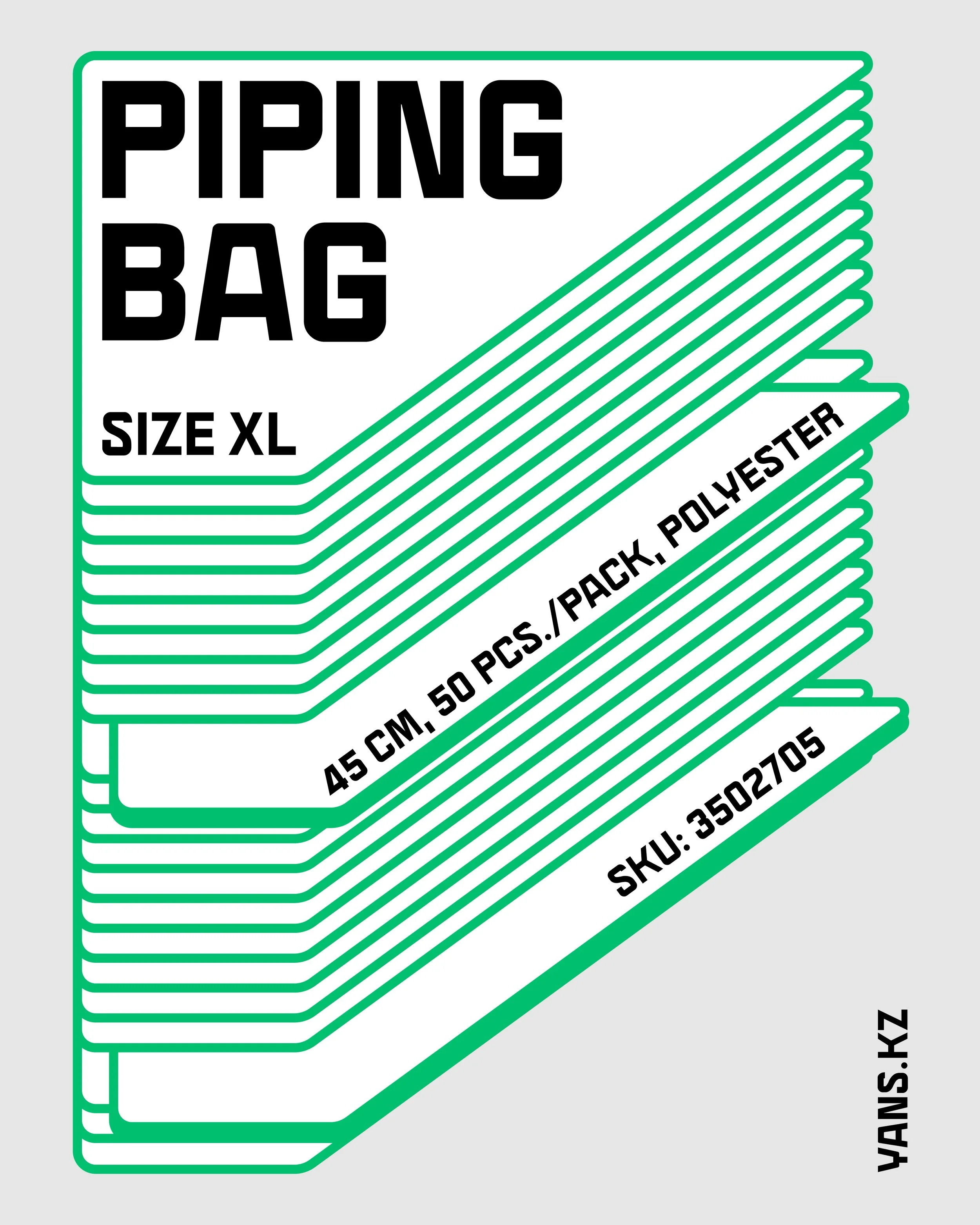
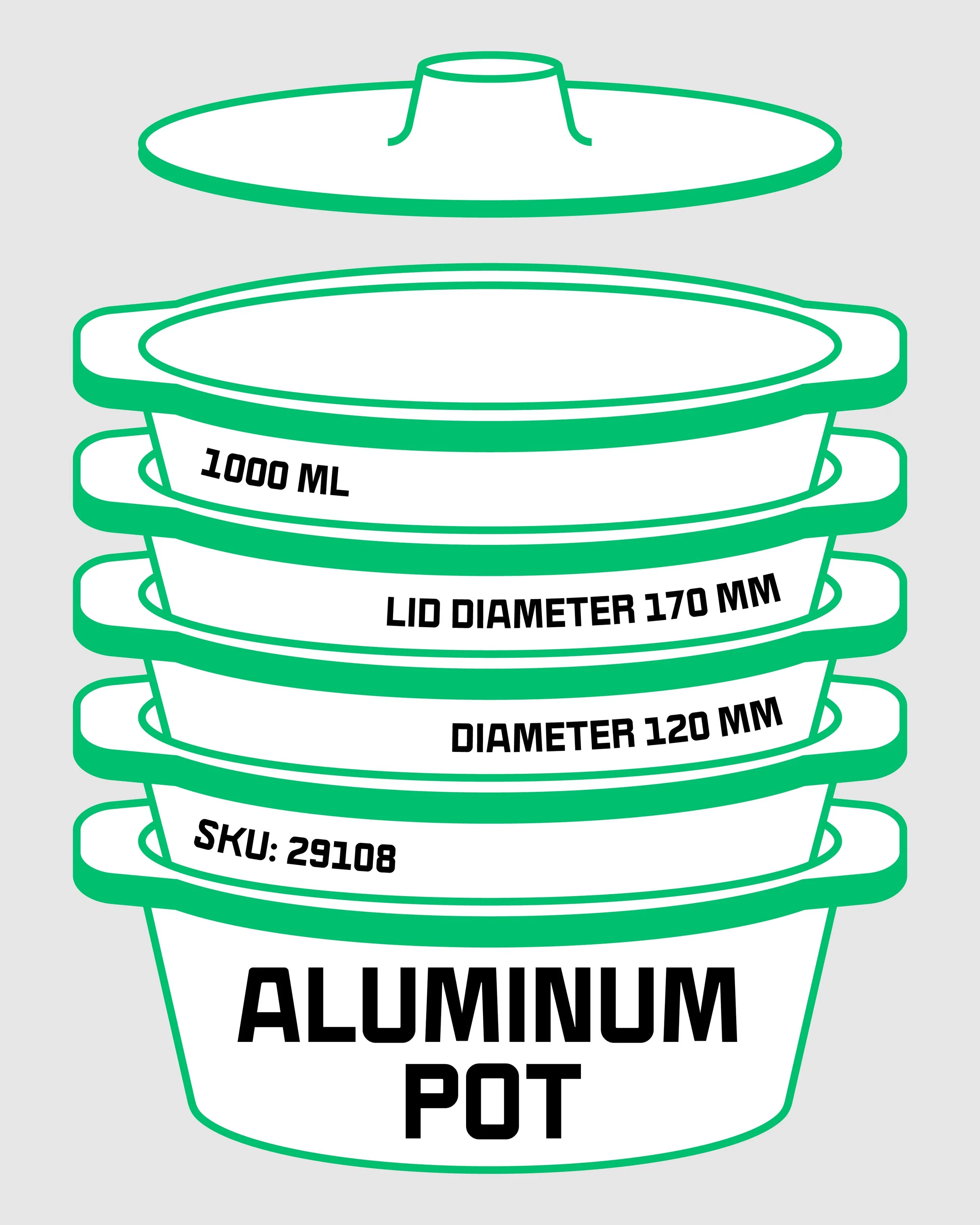
YANS products are simple and inexpensive by nature. Instead of hiding it, we embraced this honesty graphically. We intentionally “cut” titles from the top or bottom of layouts, mimicking how inexpensive items are stacked, trimmed, or packed. This deliberate imperfection becomes a stylistic element, expressing honesty, utility, and the everyday nature of the product.
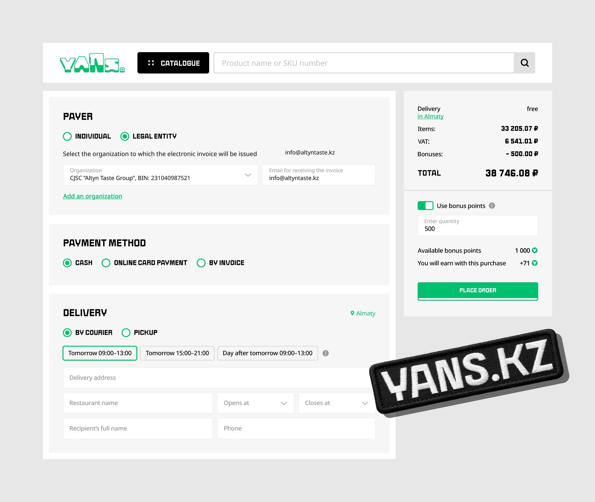
The website became one of the key touchpoints where the brand idea had to live not only visually, but functionally. Our task was to create a digital space where even without the logo, the interface would remain recognizable and unmistakably YANS. To achieve this, we focused on building a system rooted in the same principles as the core identity: structure, simplicity, and nested forms.
1. UI as a continuation of the brand concept
All interface elements are styled through the brand’s idea of “nested forms”; modular blocks, layered structures, clean geometry. This conveys the same feeling of containers and their potential, while keeping the UI intuitive and efficient for B2B users.
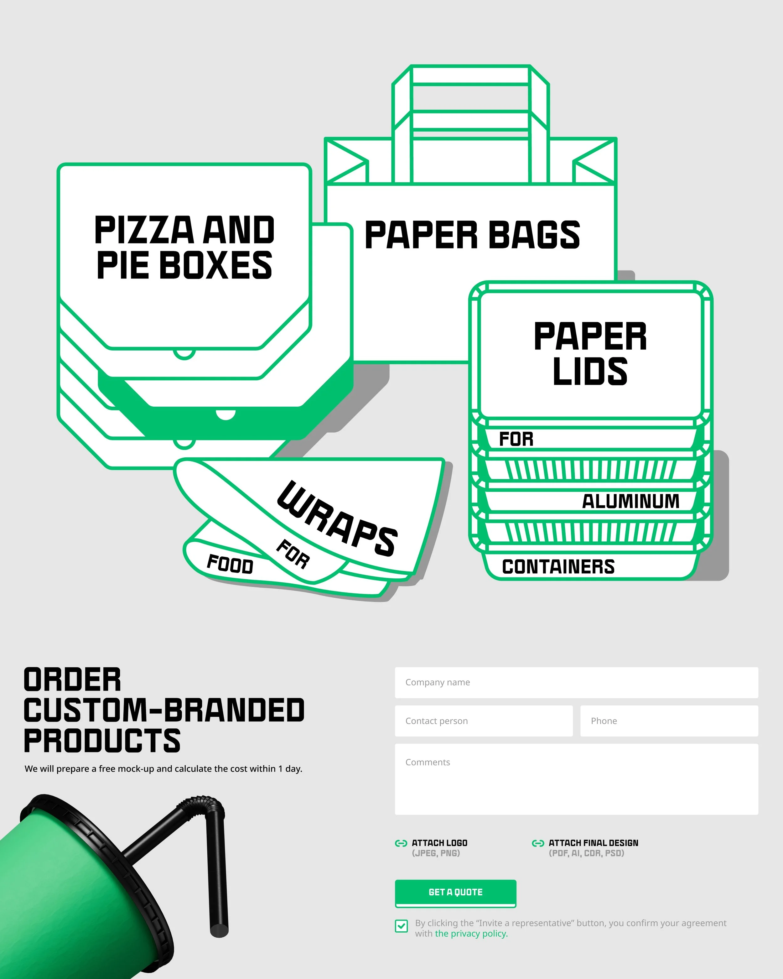
2. Seamless integration of brand visuals into digital
We adapted brand banners and communication graphics for all digital environments, ensuring full readability and consistency across screen sizes, including mobile.
3. Recognizable brand color & bold footer
A bright footer in the signature brand color creates a strong anchor on even the most utilitarian pages.It turns the website into a branded environment instead of a generic e-commerce layout.
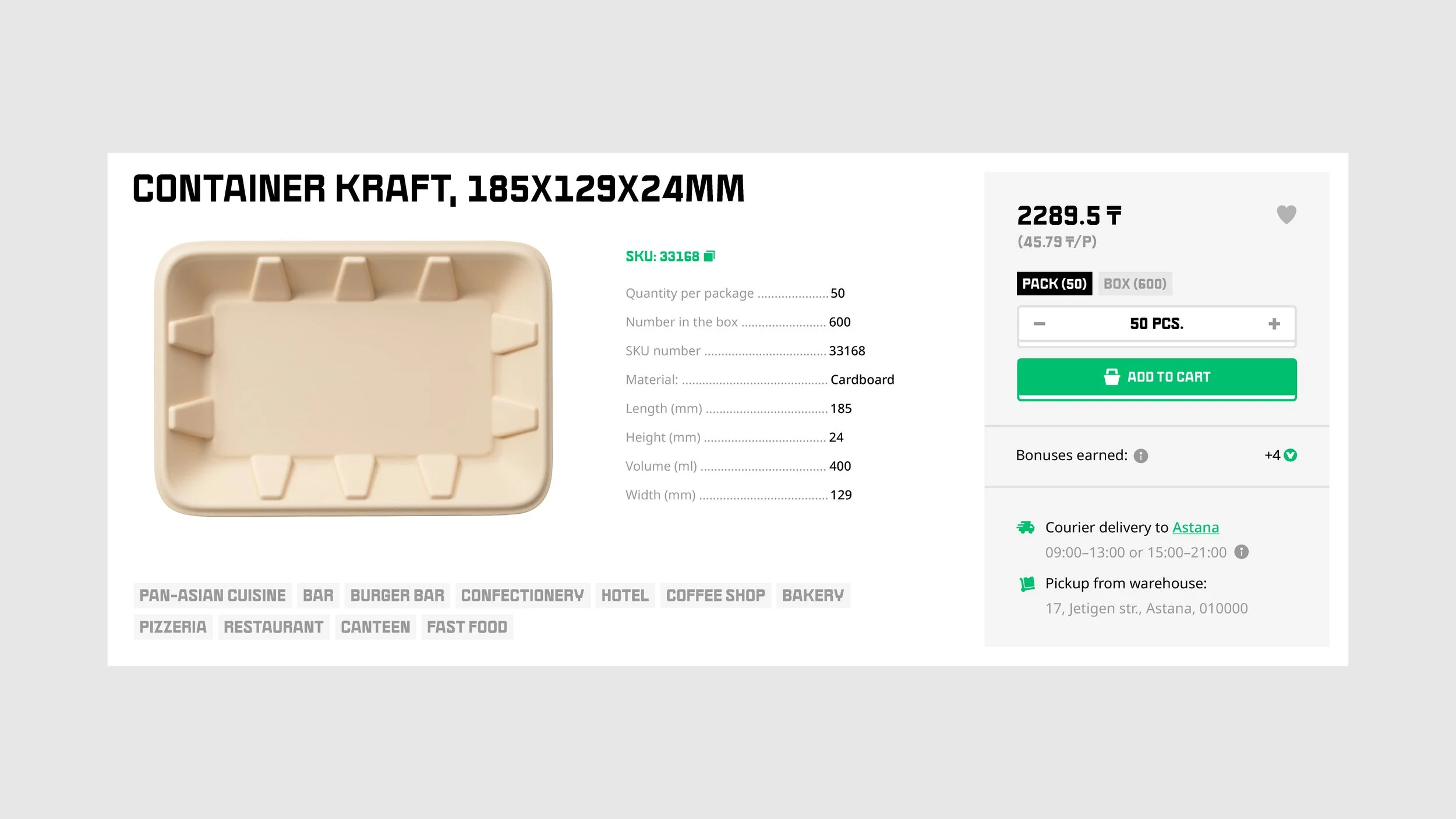
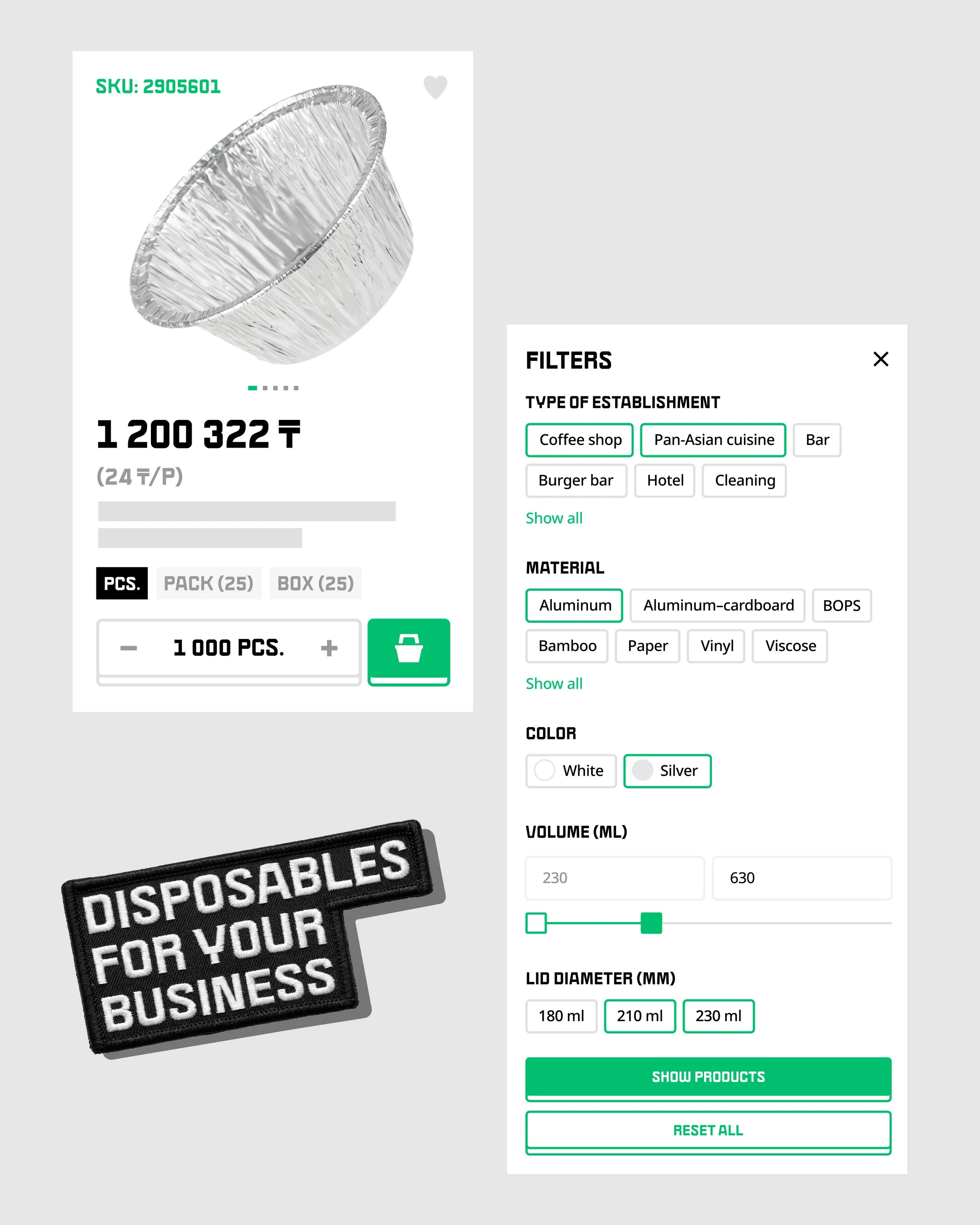
4. Product card design based on brand guidelines
The grid, spacing, and density of product cards follow the same structural logic as the brandbook.This ensures full consistency across physical and digital touchpoints, from catalog to website to e-com listing.
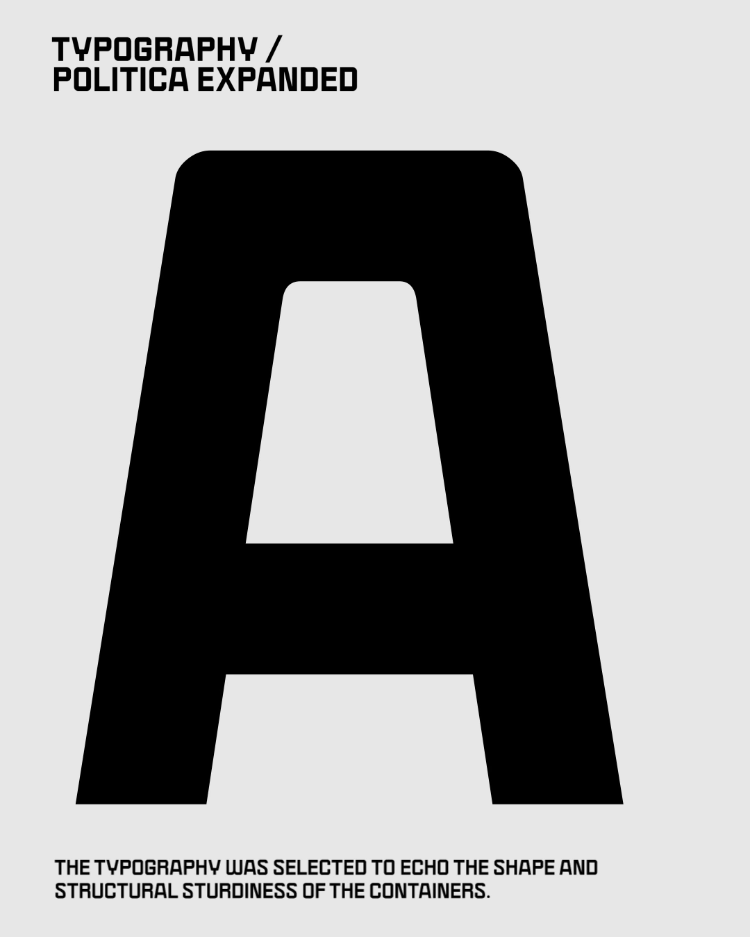
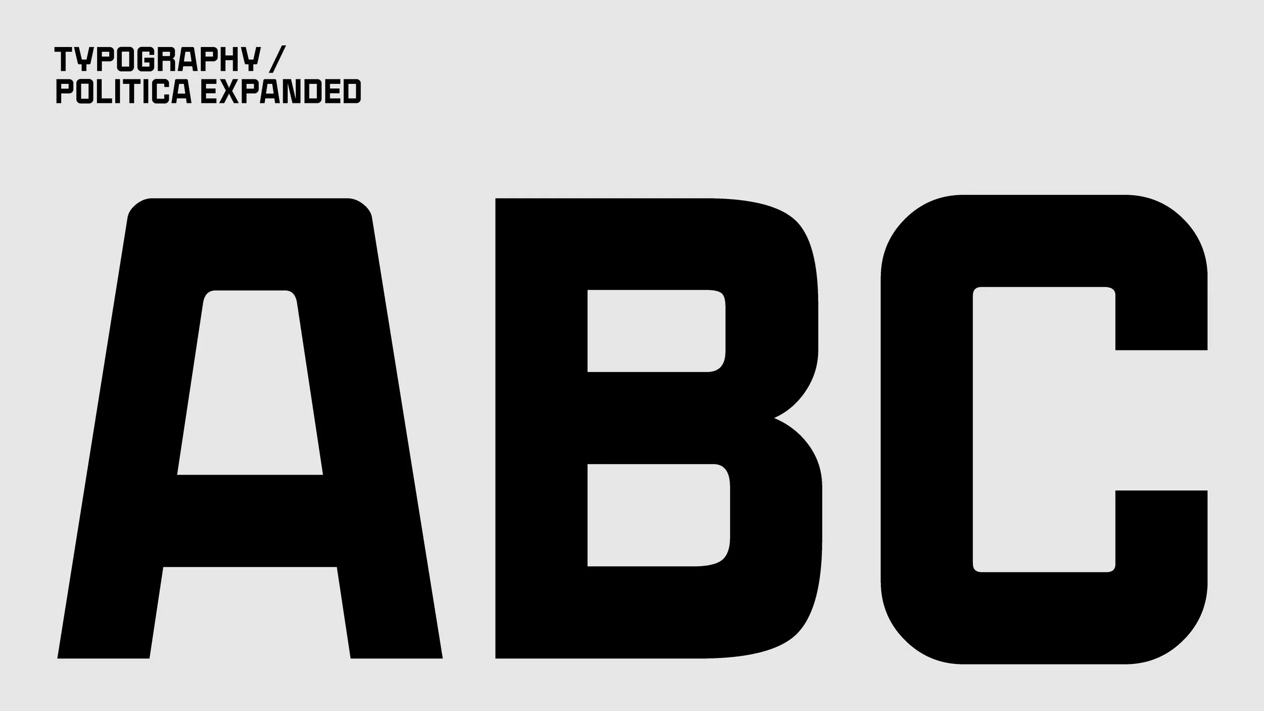
5. Typography and custom icon set
The typography resembles the shape and sturdiness of containers, while the custom icon pack extends the brand language throughout the digital environment. Together they create a cohesive system where every detail feels intentional.