live easy, pay easy
easy ® the fintech company
client: easypay llccategory: fintechcountry: armeniaservice: brand concept development, brand platform & architecture development, brand identity development, typeface design, brand guidelines, communication materials, motion designWhat if making things easy started with the brand itself?
Easy is a fintech company built around a simple but powerful promise: making everyday financial transactions easier.
Our task was to rethink the brand from the inside out starting with its brand platform and architecture and translating its core promise into a clear, flexible and recognizable visual identity.
We wanted to create more than a new look. We wanted to build a brand that embodies simplicity in everything it does: how it is structured, how it communicates, how people interact with it and how its team uses it every day.
Because when your promise is to make life easier, everything about your brand should feel easy.
One idea, two simple shapes
Before exploring the visual direction, we started with the fundamentals: the brand's purpose, positioning and architecture.
The goal was to simplify the brand structure and make it more intuitive for customers.
As part of this transformation, EasyPay became easy, while EasyWallet became easypay.
This created a clearer brand architecture and established a stronger foundation for future growth.
How do you create a visual identity that communicates simplicity and is equally simple to use?
We looked at the company's previous visual language, which already had a foundation in simple geometric forms.
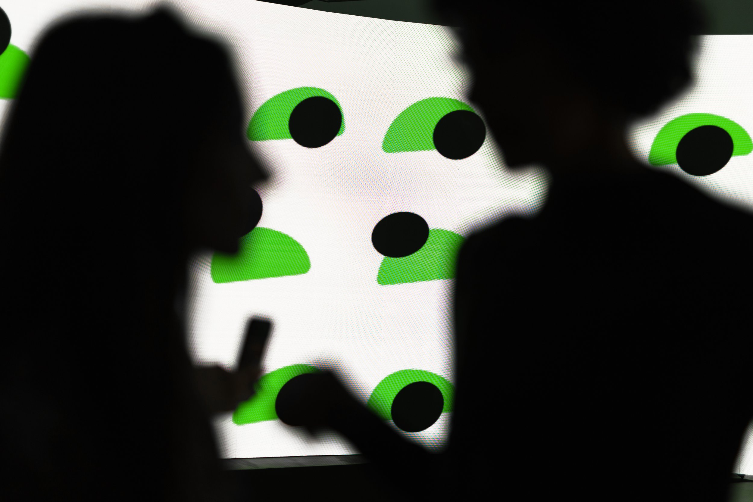
Instead of introducing an entirely new visual vocabulary, we decided to take this principle further and build an entire design system using just two shapes.
Typography: simplicity in every letter
Typography was another important part of making the brand easy.
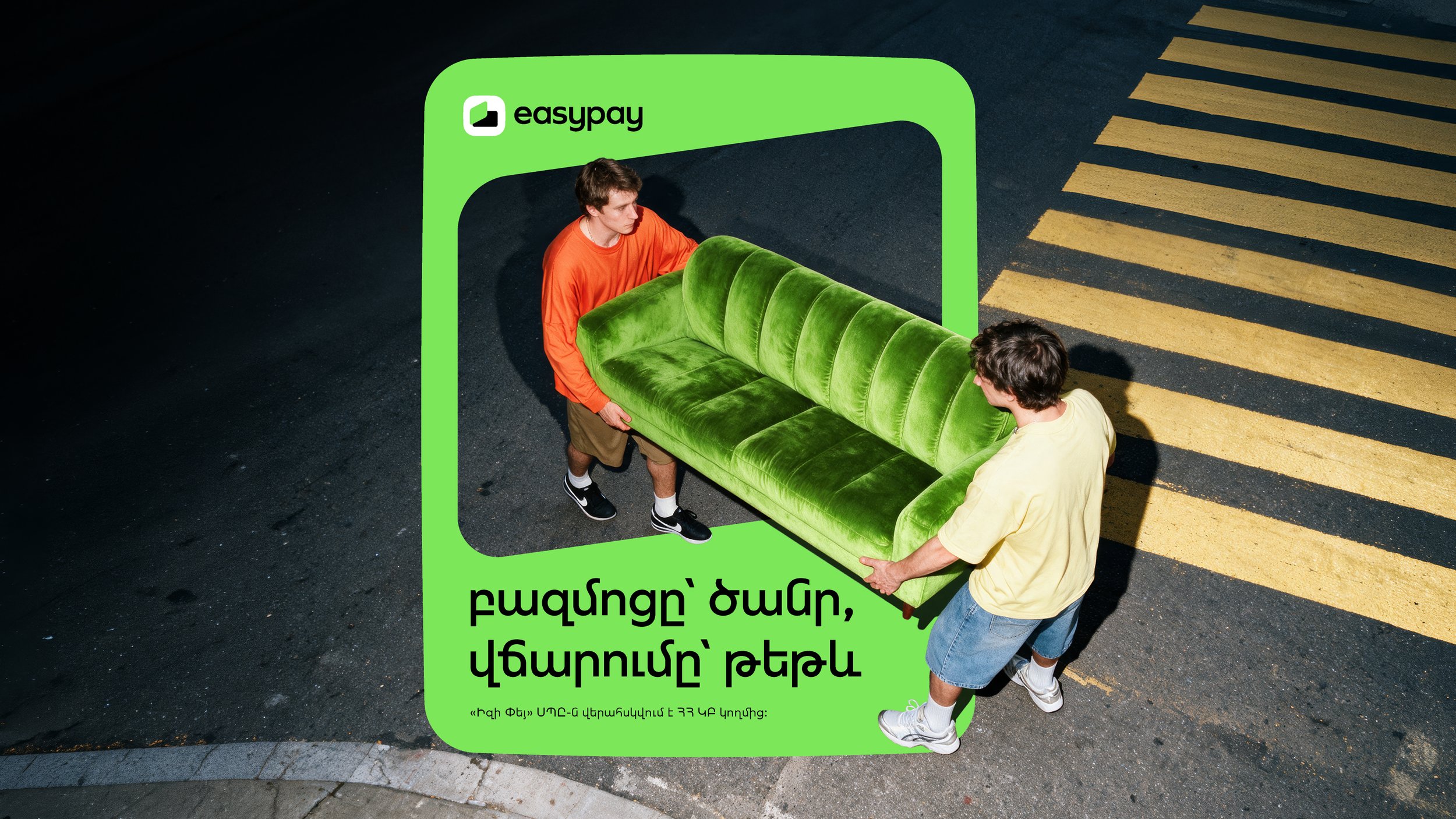
We developed a typeface based on simple geometric forms and a straightforward structure, designed to be clear and comfortable to read in both English and Armenian.
Working with Armenian typography brought an additional challenge. Armenian words are often longer, which can make layouts and text compositions more demanding.
We wanted to create a typeface that would work effortlessly regardless of the amount of text - whether it was a short message, a headline or a longer piece of communication.
The result is a consistent typographic system that brings both languages together while keeping readability at the centre.

Iconography: two shapes, a whole language
We carried the same principle into the iconography.
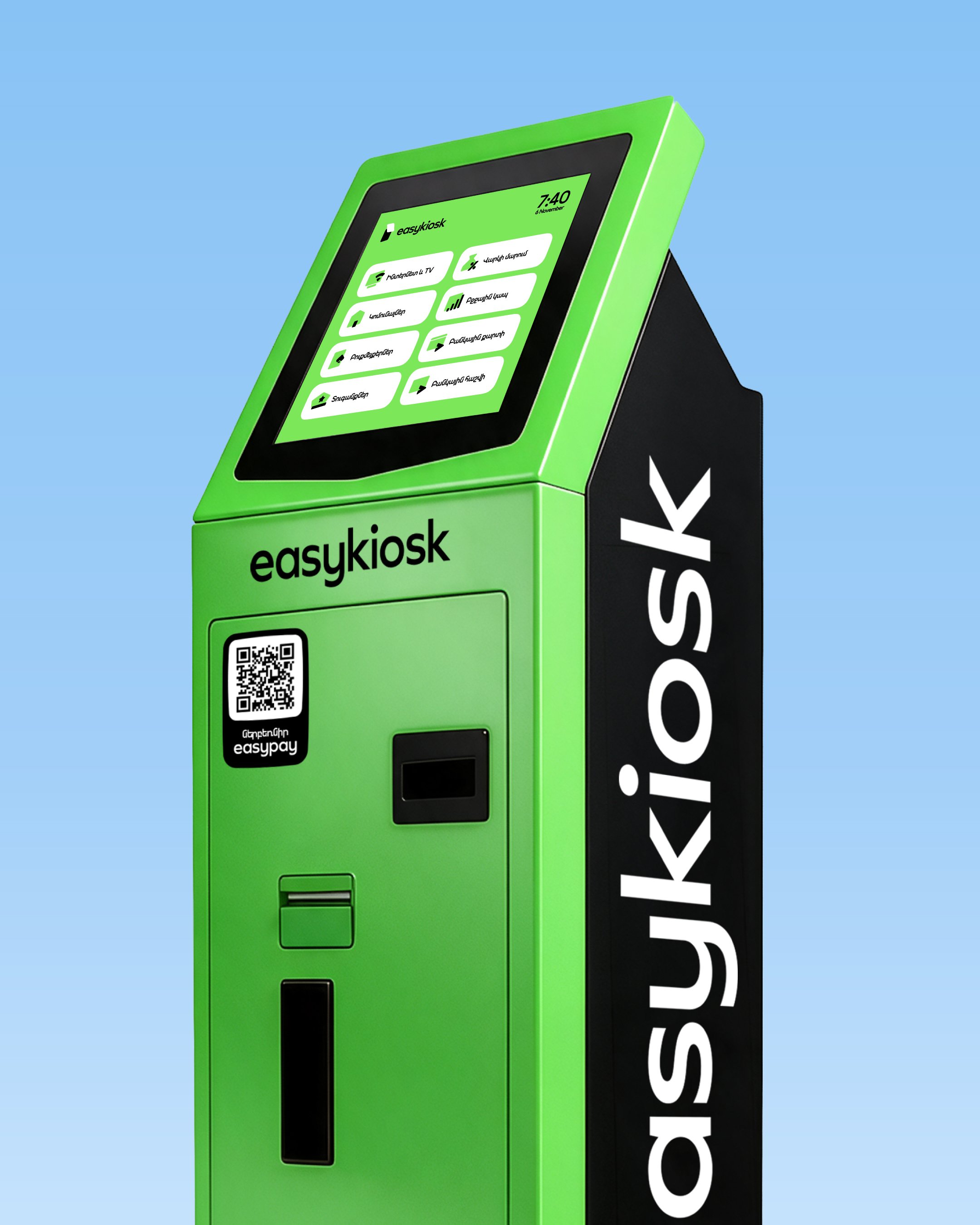
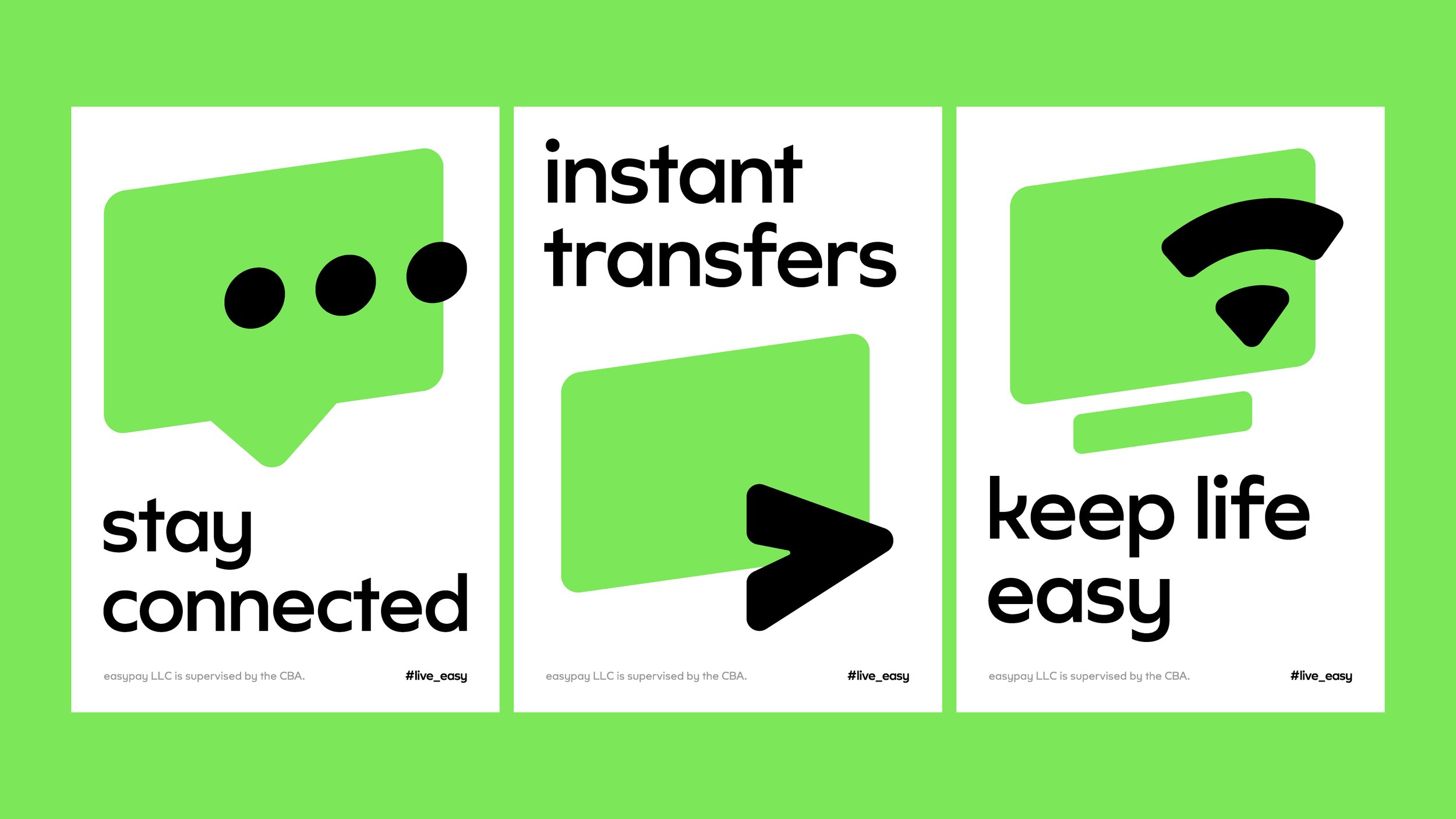
We built the entire icon system around two basic shapes: a front shape and a back shape. By combining and overlapping them, we created a sense of depth and perspective, turning two simple elements into a recognizable visual language.
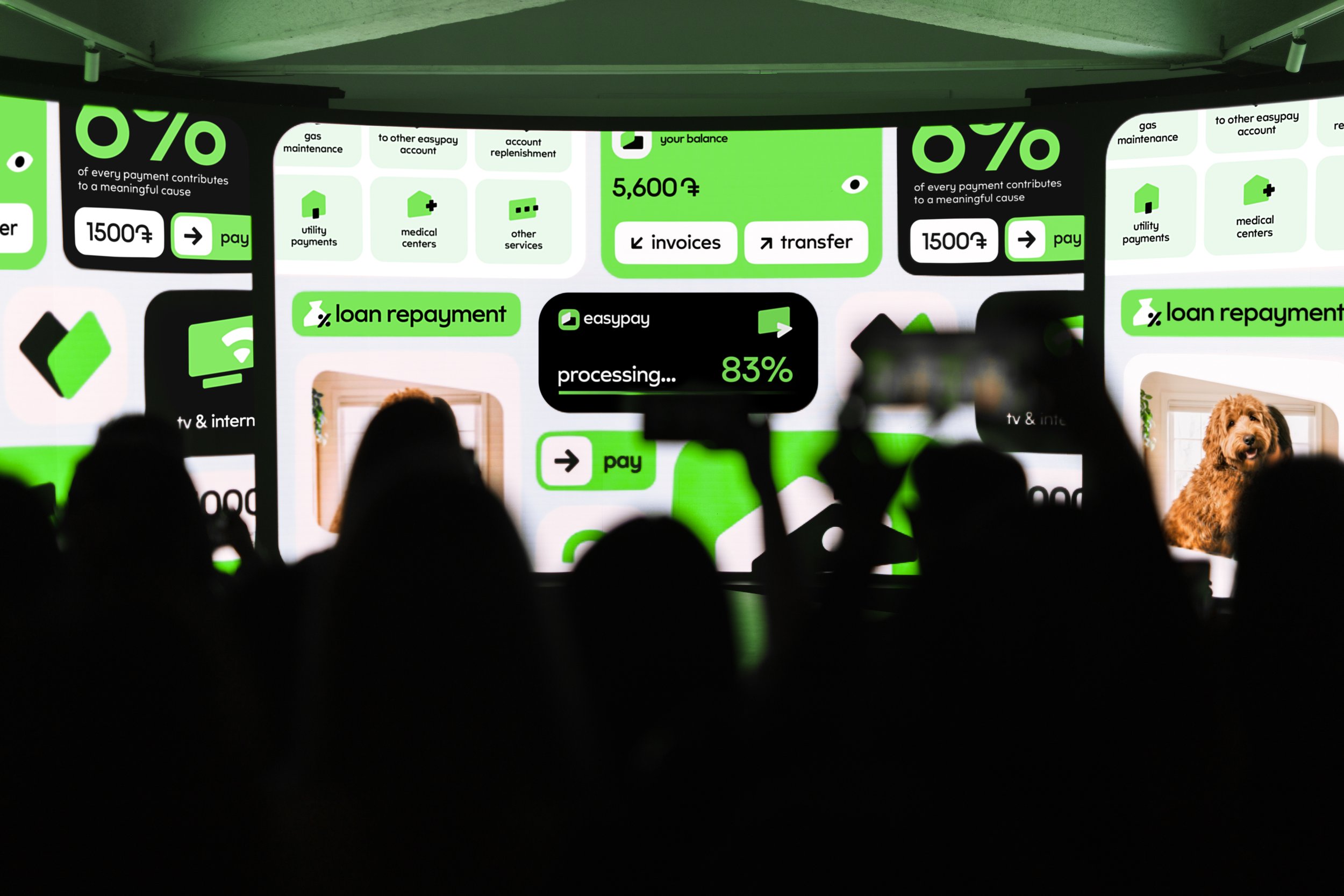
This approach allowed us to create a consistent family of icons that are simple, distinctive and easy to understand across different services and communication platforms.
Simplicity, Made Visible
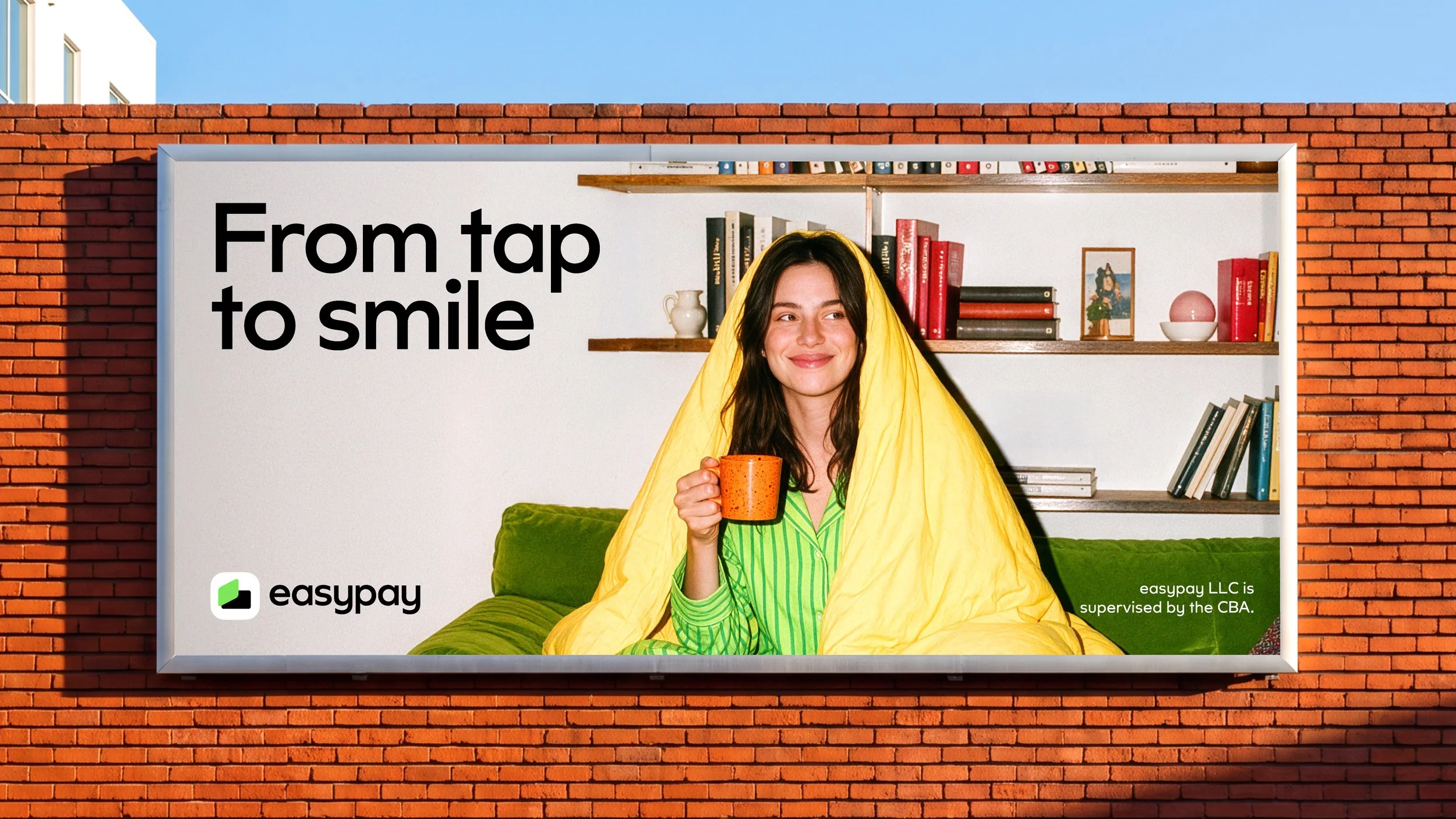
We brought the brand's promise of simplicity to life through every element of its identity - from brand architecture and typography to iconography and visual communication.
Built around just two shapes, the new visual system is flexible, recognizable and easy to use, giving easy a consistent foundation for all its future communications.
A simple idea, translated into a complete brand experience.
That’s easy.